pinterest board
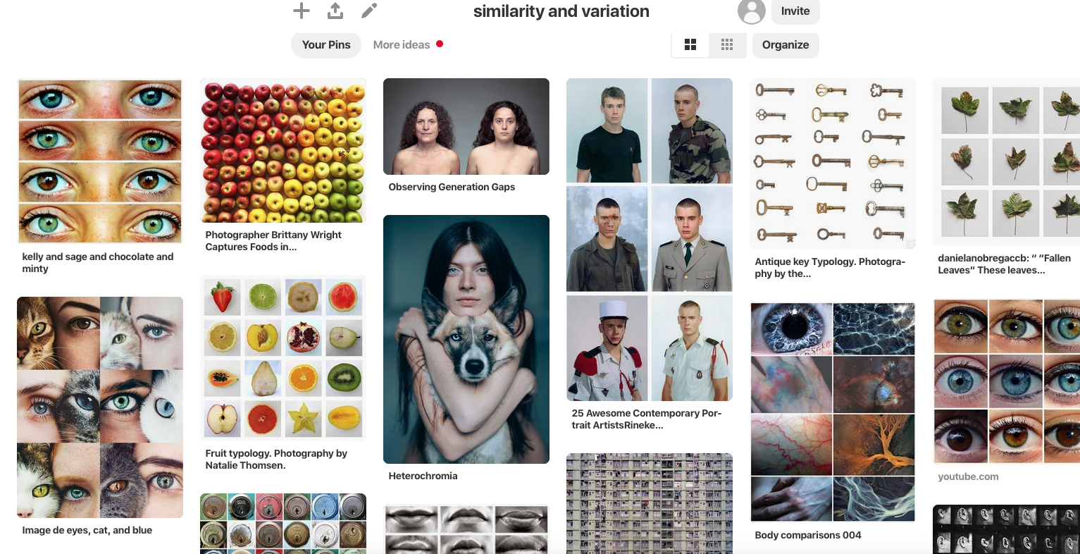
half term tasks
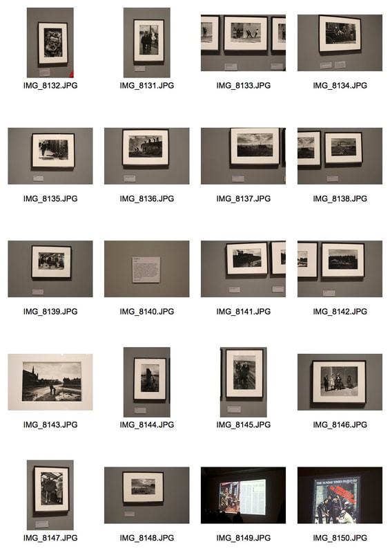
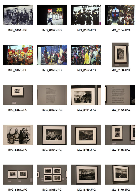
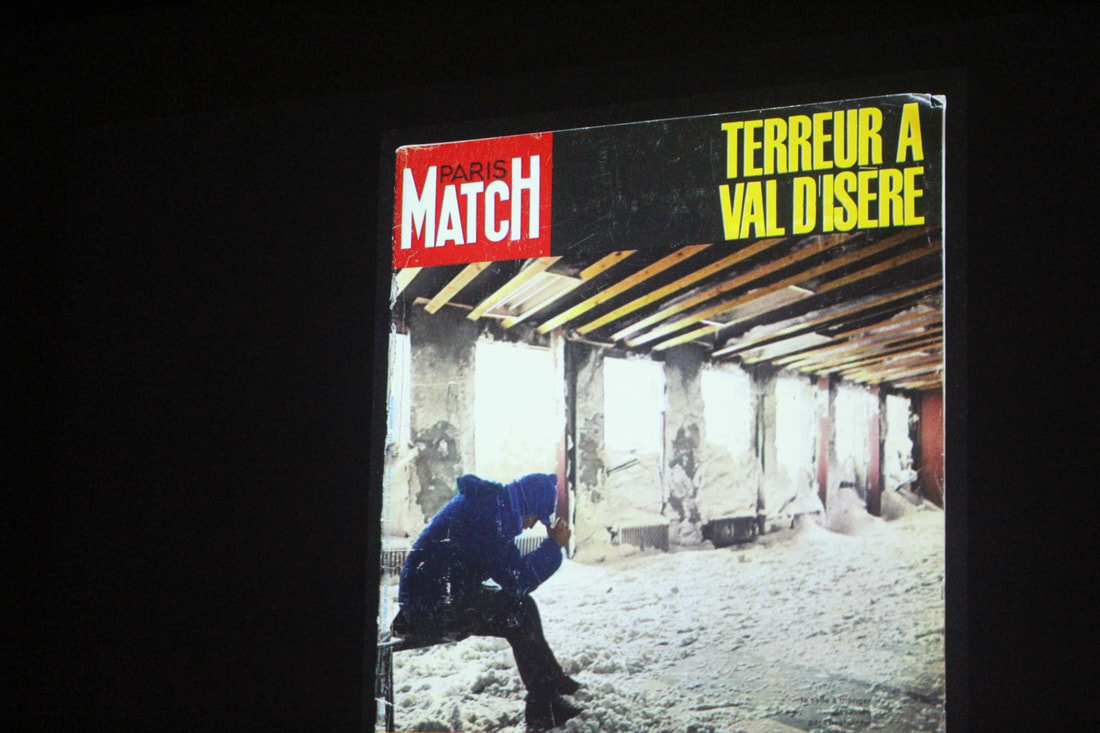
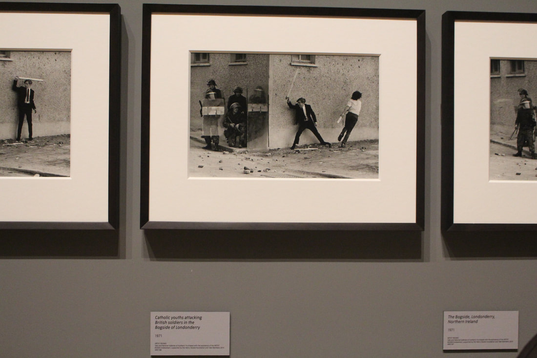
Artist analysis - don mccullin
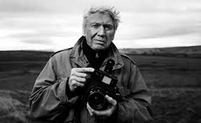
Don McCullin is one of the greatest living photographers. Few have enjoyed a career so long; none one of such variety and critical acclaim. For the past 50 years he has proved himself a photojournalist without equal, whether documenting the poverty of London’s East End, or the horrors of wars in Africa, Asia or the Middle East. Simultaneously he has proved an adroit artist capable of beautifully arranged still lifes, soulful portraits and moving landscapes.
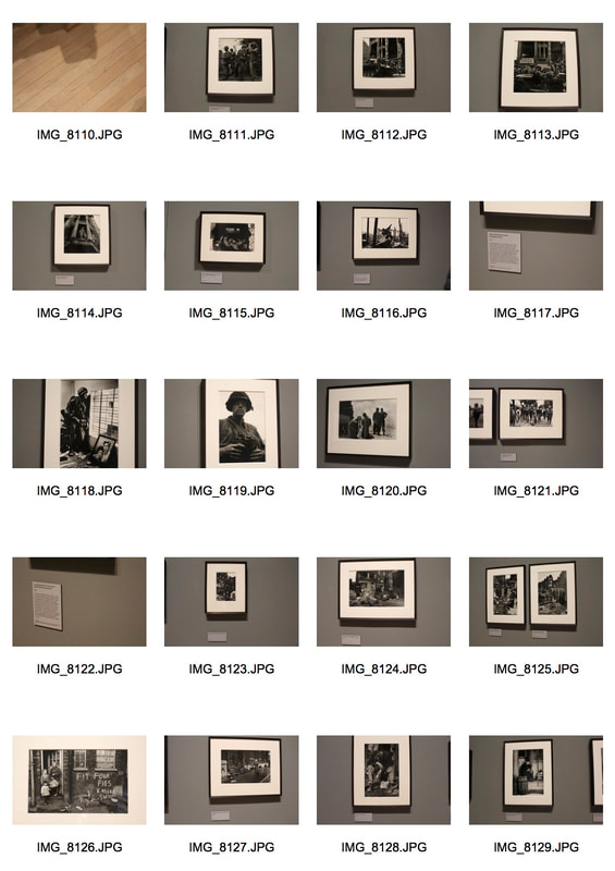
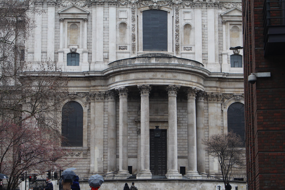
exhibition visit - Don McCullin
This exhibition by don Mcullin showcases some of the most impactful photographs captured over the last 60 years. It includes many of his iconic war photographs – including images from Vietnam, Northern Ireland and more recently Syria. But it also focuses on the work he did at home in England, recording scenes of poverty and working class life in London’s East End and the industrial north, as well as meditative landscapes of his beloved Somerset, where he lives.Sir Don McCullin was born in 1935 and grew up in a deprived area of north London. He got his first break when a newspaper published his photograph of friends who were in a local gang. From the 1960s he forged a career as probably the UK’s foremost war photographer, primarily working for the Sunday Times Magazine. His unforgettable and sometimes harrowing images are accompanied in the show with his brutally honest commentaries.
|
|
|
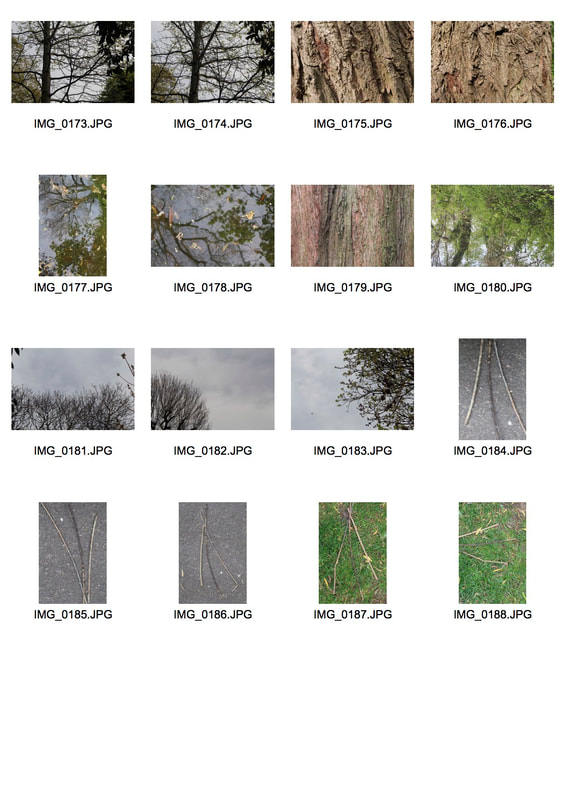
typology task
artist analysis - Boris Mikhailov
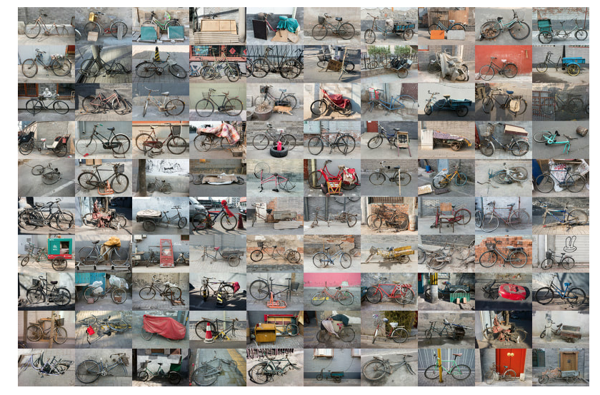
Zhao Xiaomeng - Bicycles in Beijing, NowThe fate of the bicycle can tell us a lot about the modern Chinese economy. As it thunders remorselessly towards ever greater industrialisation, the car has superseded the bicycle as the preferred mode of transport. In cities like Beijing, bikes have become relics of a bygone age, no longer a symbol of a unifying culture of cycling but rather emblems of social marginalisation.This typology by artist Zhao Xia0meng documents a radical change in people's living conditions and economic circumstances through portraits of their bikes, some of which still cling to the last remnants of a useful life. As the old Beijing saying goes, "a dog's life is better than no life."
my response
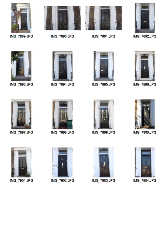
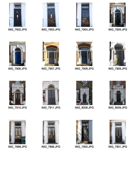
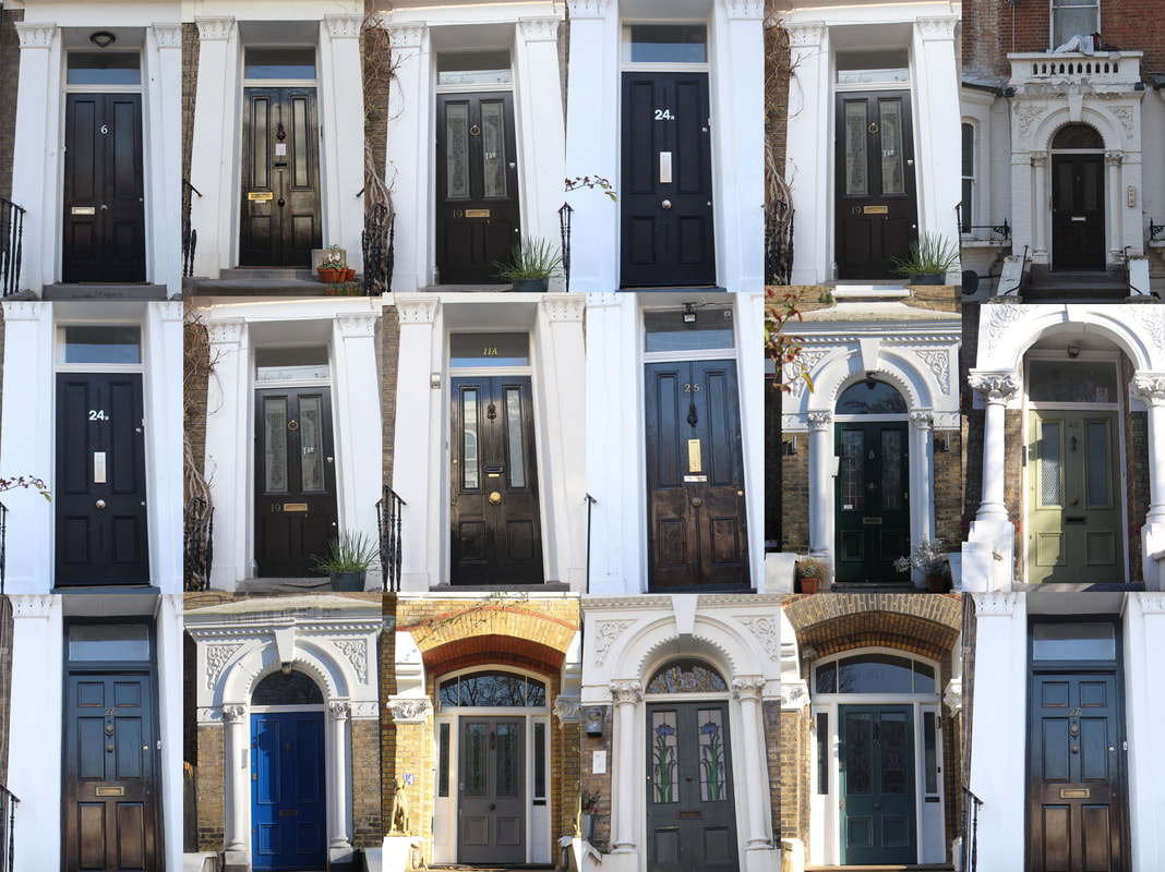
For this typology task we were asked to create our own typology series documenting repeated forms. In order to do this I chose to photograph an a series of doors on the same street in my local area of Highbury. Using photoshop I then laid out my images in a collage layout in order to create a typology. Overall my typology did not tun out the way that i wanted it to,this is because the images were wonky and were not straight. They were also taken at different angles which meant that the images in the typology look lopsided. in order to improve this and make my outcome more effective next time i will use a tripod to make sure that my images are all aligned and not off-centre.
|
|
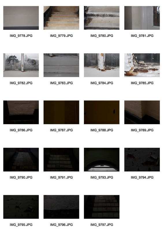
variation in the city task
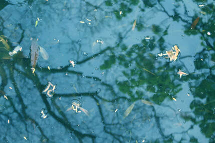
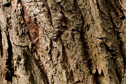
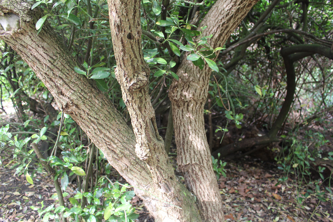
artist analysis - Antony Cairns
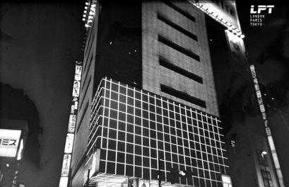
Antony Cairns is an artist stretching the boundaries of the photographic medium. City scapes, from London to Tokyo, feature as a backdrop for his investigation into the tool of photography. Fascinated by its reproductive nature, Cairns explores never-seen-before processes and formats to create his work.A traditionally trained photographer who learnt his trade at the London College of Printing towards the end of the 1990s, his photographic practice has remained rooted in chemical-based techniques. Shooting almost exclusively on black & white film, he prints all his own work, often experimenting with forgotten or discarded methods, and frequently becoming engrossed with the process, its imperfections and oddities.
my response
For this variation in the city task we was asked to Photograph the city in different ways with the aim of producing different variations of photographic processes. I had to look for ways in which the locations are similar but at the same time are different. I also had to see is there is a material shape or building that connects the locations. I found this particulary difficult as I was not able to get close and take close ups of some of the structures I took pictures of, due to being so far away. This meant that I was not able to see and photograph the details of some structures in order to compare the different builings.
|
|
|
chosen edits
variation and similarity in landscapes
artist analysis - Kevin McGloughlin
|
|
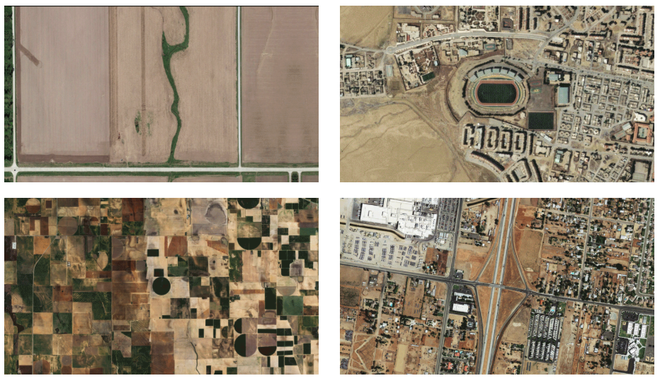
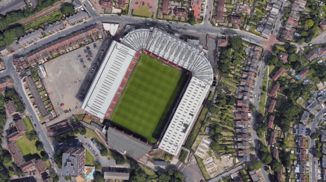
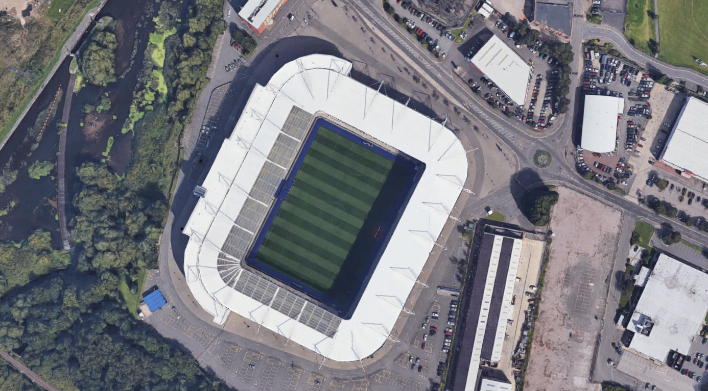
Kevin Mcghloughlin is a filmaker and artist based in Sligo, Ireland, primarily working as a director - animator. Kevin showed an interest in the arts from a very young age and always had a thirst for innovation and creativity. His initiative to create immersive and thought provoking experiences using unconventional methods of film and animation.In EPOCH, the new short film by Irish director and animator Kevin McGloughlin, aerial images of the Earth are pieced together to compare the structural similarities of various suburbs, highways, and fields. When flashed one after the next, buildings and roads form circles and squares, while dozens of cul-de-sacs appear to elongate and morph as they flash on screen.
my response
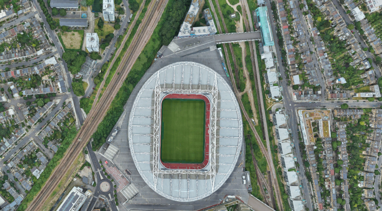
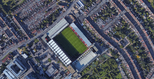
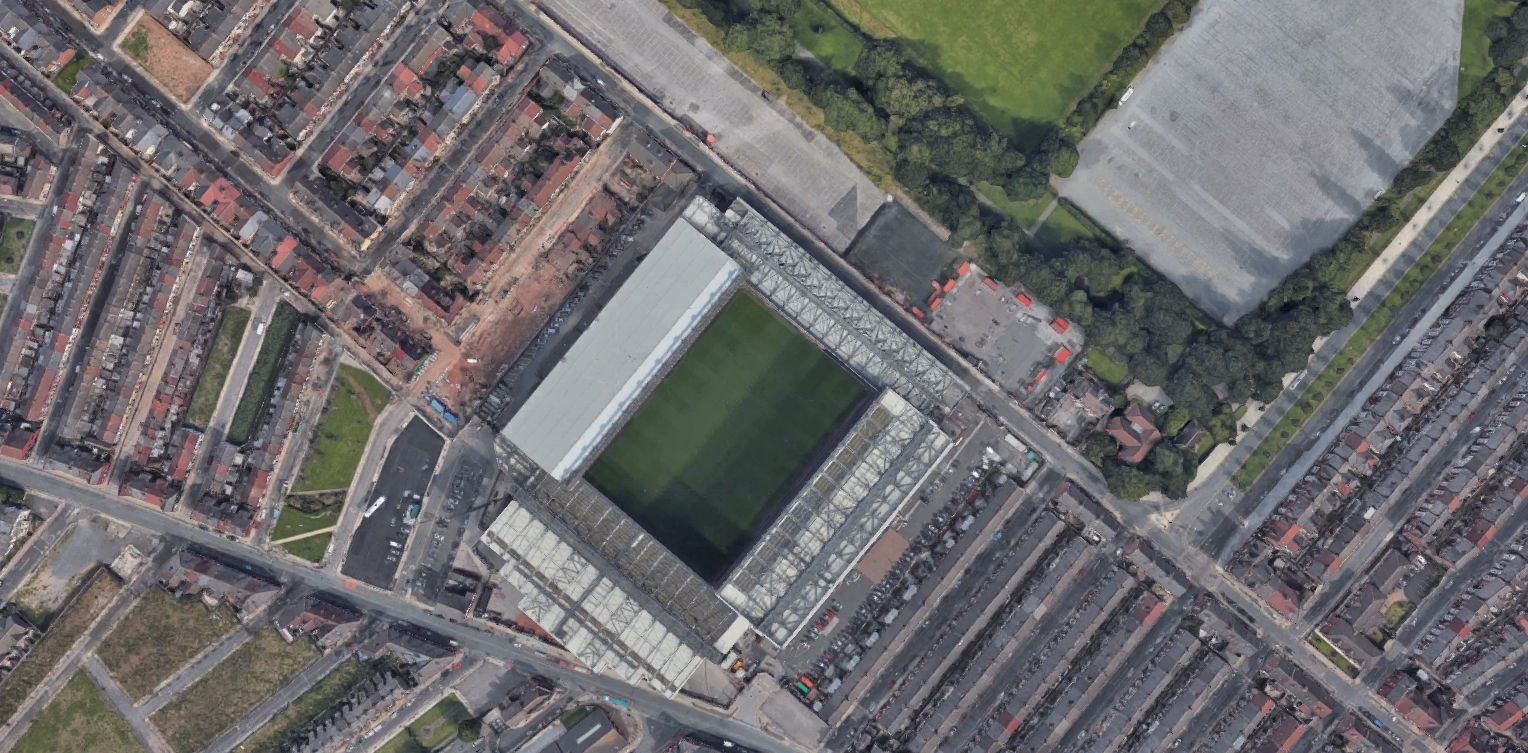
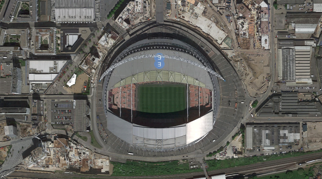
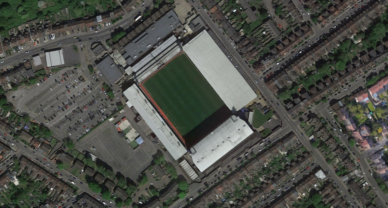
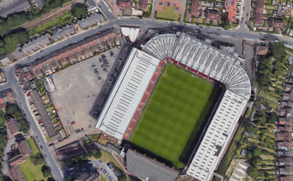
for the variation and similarity in landscapes task we were asked to consider different areas in the city, country, world that you have been to and consider the variations and similarities that these different location have. Using google earth take screen shots of your chosen locations photographed from above. When you have a collection of images start to create a series of different giffs in the style of the McGloughlin brothers. I was also asked to Consider how dense urban environments may look in comparison to vast unpopulated areas place the giffs alongside each other so they can be compared and viewed at the same time. For this task I decided to create a gif of different football stadiums in England. Using google satellite images I looked u the location of each football stadium and screenshot the image of the stadium and then using photoshop I created a gif of all of the cropped images of football stadiums. Overall I was happy with the screenshots of the football stadiums I had taken however once I put them into a gif I learnt that the images I had screenshot were not all the same size which meant that some stadiums looks bigger in the gif than others which doesn't make the gif Flow as well. To improve this outcome next time I will make sure all the screenshots are taken from the same distance so that some of the images are not as zoomed in.
|
|
|
development
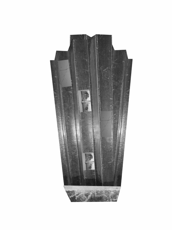
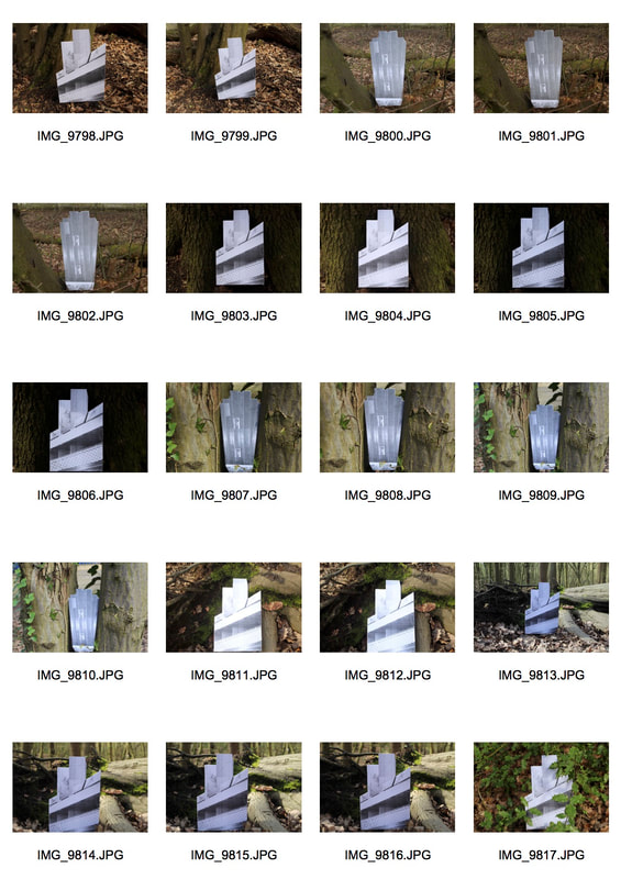
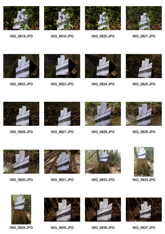
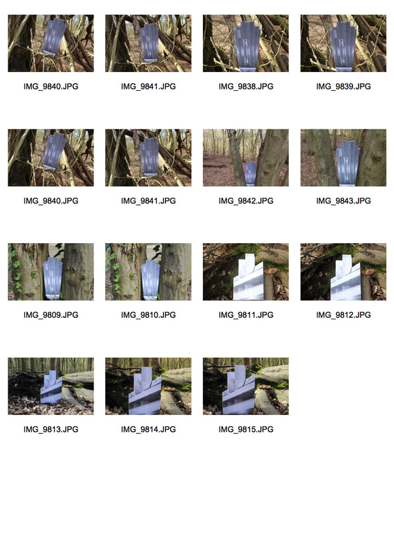
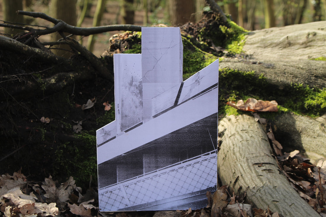
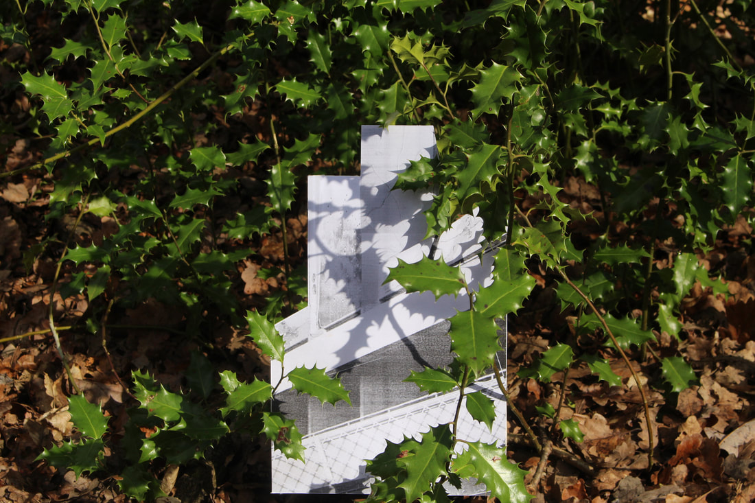
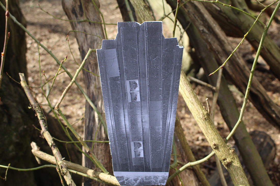
variations between layout and part
artist analysis -Noémie Goudal
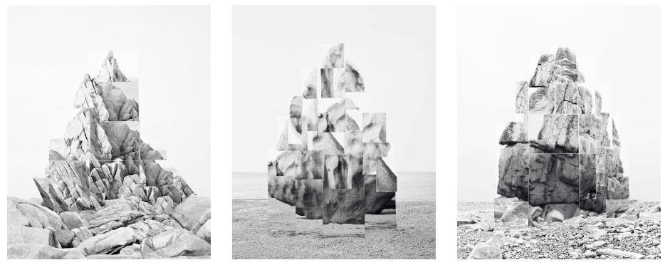
Noémie Goudal’s practice is an investigation into photographs and films as dialectical images, wherein close proximities of truth and fiction, real and imagined offer new perspectives into the photographic canvas. The artist questions the potential of the image as a whole and looks at variation of meaning, by reconstructing its layers and possibilities of extension, through landscapes’ installations. In her Soulevement series, she creates images of rock formations which turn out to be photographs of sets of mirrors installed in the landscape.
my response
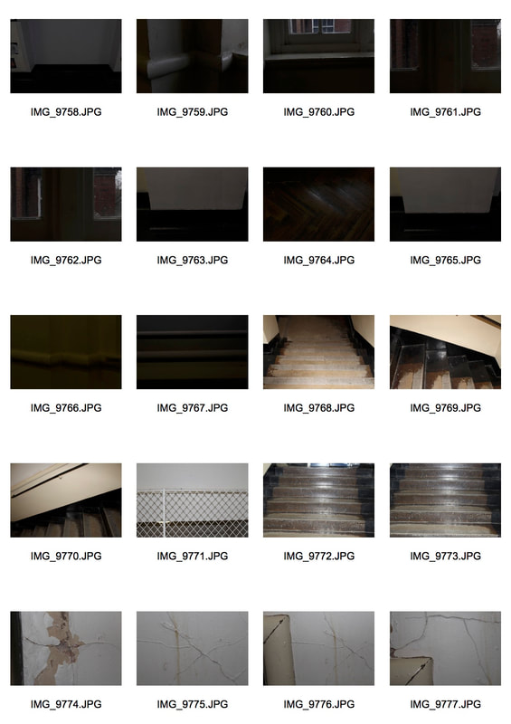
For the variations between layout and part task I was asked to Using the work of Goudals as inspiration look for interesting landscapes in the woods and using the mirrors provided place them into the scene and take a series of photographs that depict the landscapes in different points of views. I was instructed to Focus on capturing both Variety and similarity in your photographs. in order to do this I first had to create a building so I went and photographed different parts and details of my school building so that I could create a new building using photoshop. the tools I used on photoshop to create my own building were the duplicate layer tool and skew and the distort tool in order to make my images look like an actual building. After I had completed my building I then printed it out and mounted it on a peace of card so that it was able to stand on its own once placed in the woods and nature.
|
|
development
further development
|
|
|
three strands
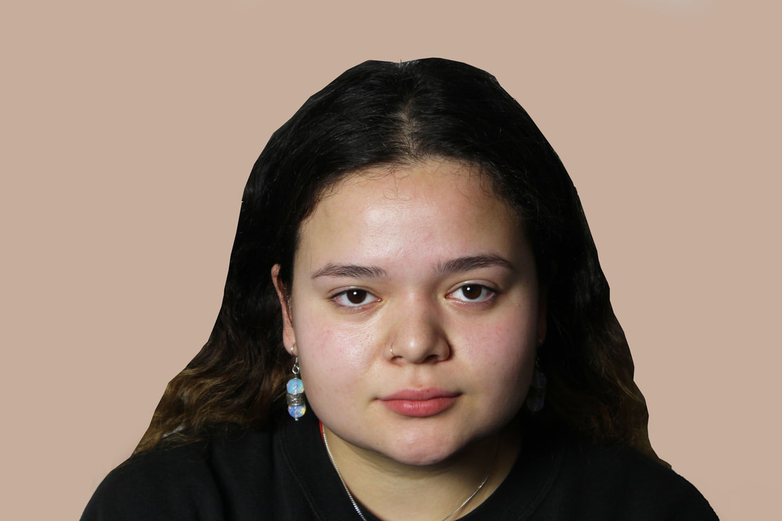
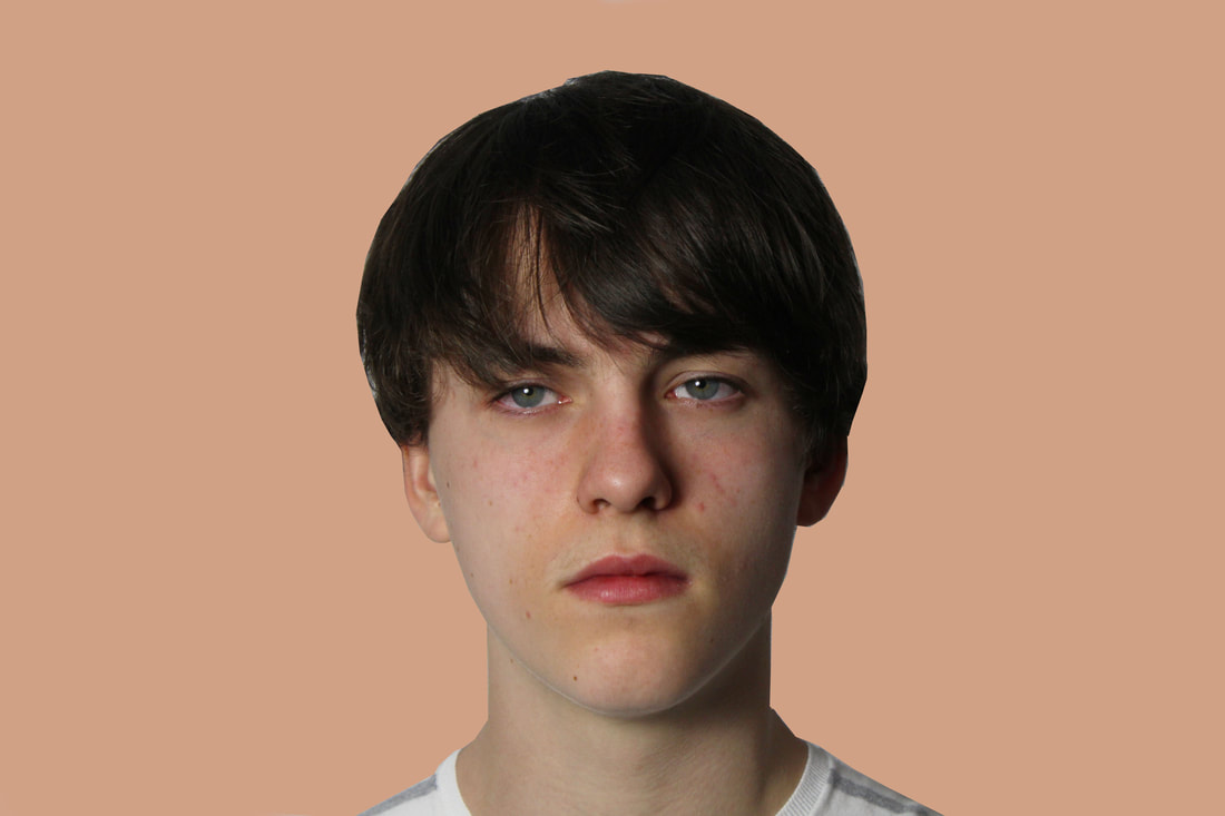
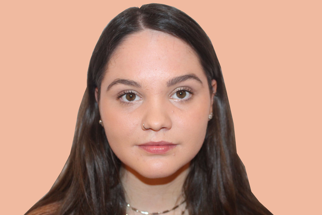
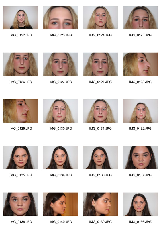
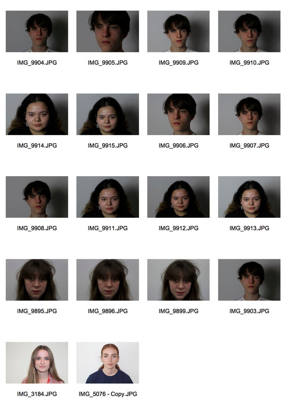
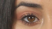
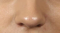
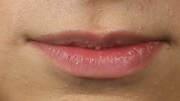
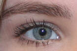
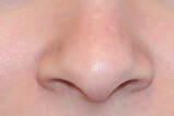
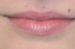
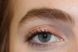
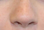
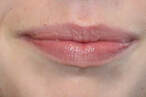
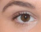
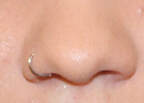
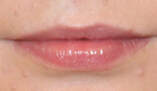
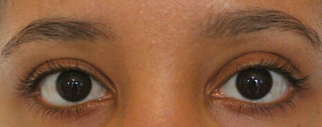
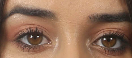
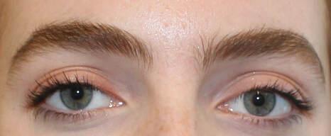
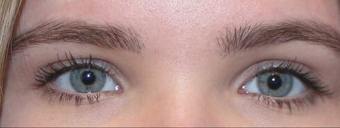
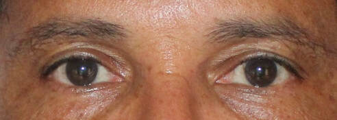
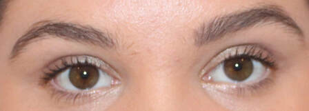
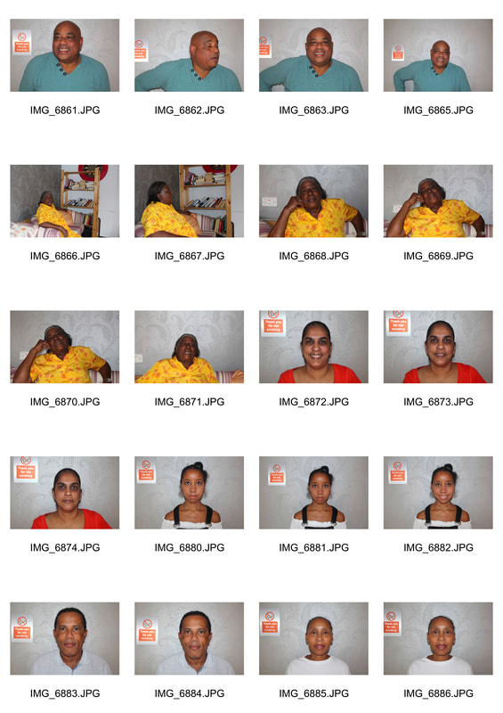
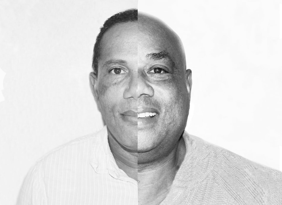
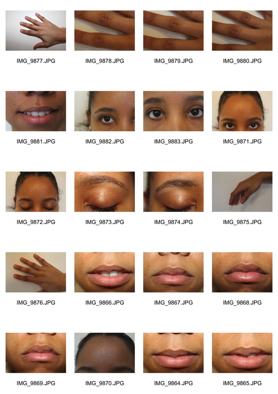
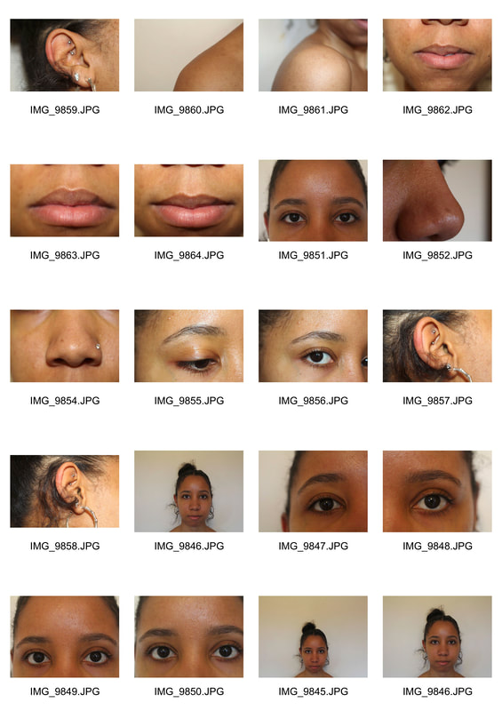
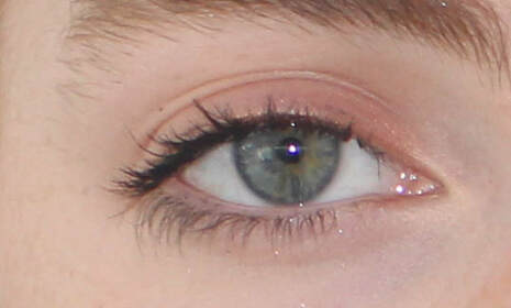
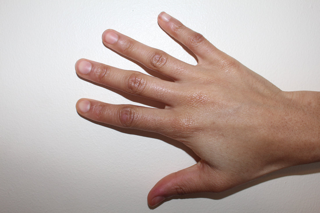
strand one - Variation in the face
For my first stand I will explore variations in the faces of different people. To do this I will look at details of the appearances of different people such as skin tone , eye colour and other elements of the face in order to see the variations and similarity. To further develop this strand I will also explore the similarity variation within family as well as the similarity between the human body and nature.
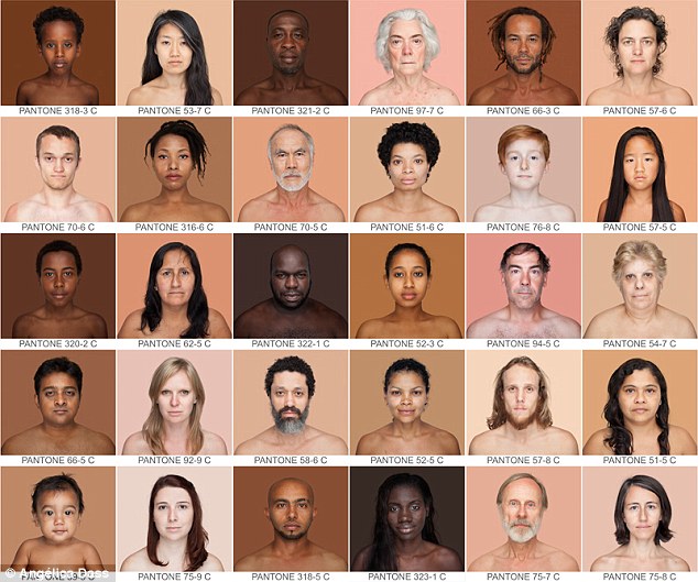
artist analysis - ANGÉLICA DASS
Angélica Dass is an award-winning photographer living in Madrid, Spain. Originally from Rio de Janeiro, Brasil, she is acutely aware of how small differences in skin tone can swell into large misconceptions and stereotypes about race. She is the creator of the internationally acclaimed Humanæ Project, a collection of portraits that reveal the diverse beauty of human colors. The initiative has traveled to more than 30 countries across six continents —from The World Economic Forum in Davos to the pages of National Geographic — to promote dialogue that challenges how we think about skin color and ethnic identity.Angélica’s work transcends the museums and finds in school classrooms a great universe of work. She amplifies the educational message of Humanae through institutional collaborations around the world, such as collaborations with city councils of different cities in the Basque Country, teacher training schools in Madrid, highschools in the Czech Republic, or with UNESCO and the Government of Chile, reaching an impact of more than 50 thousand students in a week. She is also a powerful and inspiring speaker who has lectured at important organizations, such as the University of Salamanca, the University of Bologna, or the UERJ - Rio de Janeiro; as well as the International Congress of Fundraising - The Resource Alliance, at National Geographic and at the World Economic Forum, as a cultural leader.
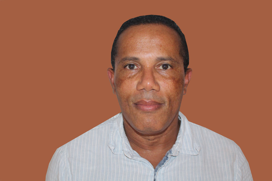
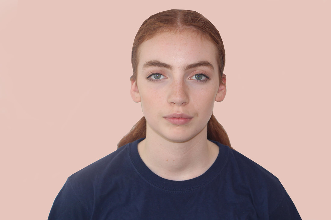
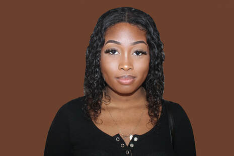
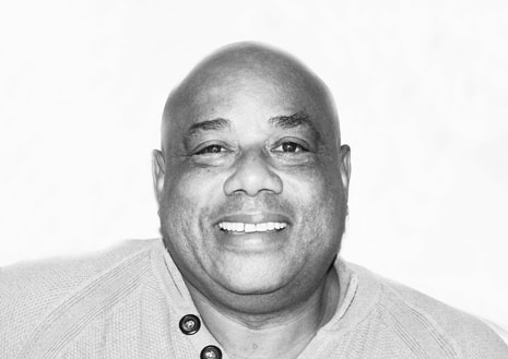
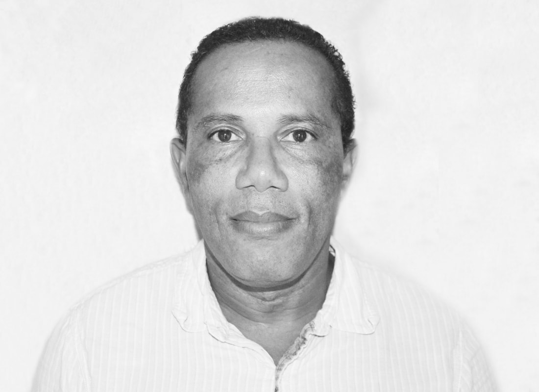
My response
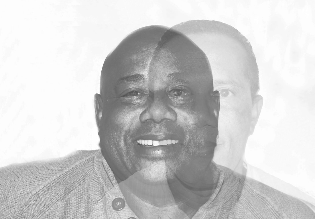
For my response to Angelica Dass' work i decided to take a series of portraits and change the colour of the background in the shade of the persons skin. In order to this I placed the image of the portrait into photoshop and used the eyedropper tool to get the colour of the persons skin and make the background the colour of the persons complexion. Overall the outcome was effective however In order to make the outcome of the portraits more effective I should take more time and care with filling in the background as there were some small places around the heads of the portraits where the background was not filed in properly.To further develop my response I decided to take close ups of the same features on different people in order to see how they compare and if there are any similarities or variations.
|
|
|
|
|
|
|
|
|
|
|
|
further development- genetics
|
|
Chosen edits
|
|
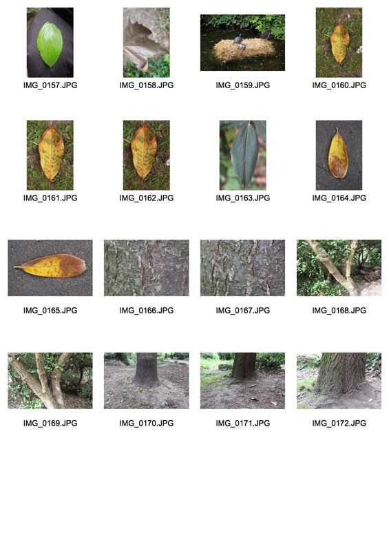
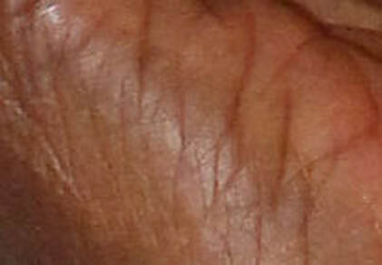
further development - similarity between nature and the human body
For my further development I decided to look at the similarity between nature and the human body to see if there are any similarities or variations
|
|
|
|
chosen edits
|
|
strand two - variation in religion
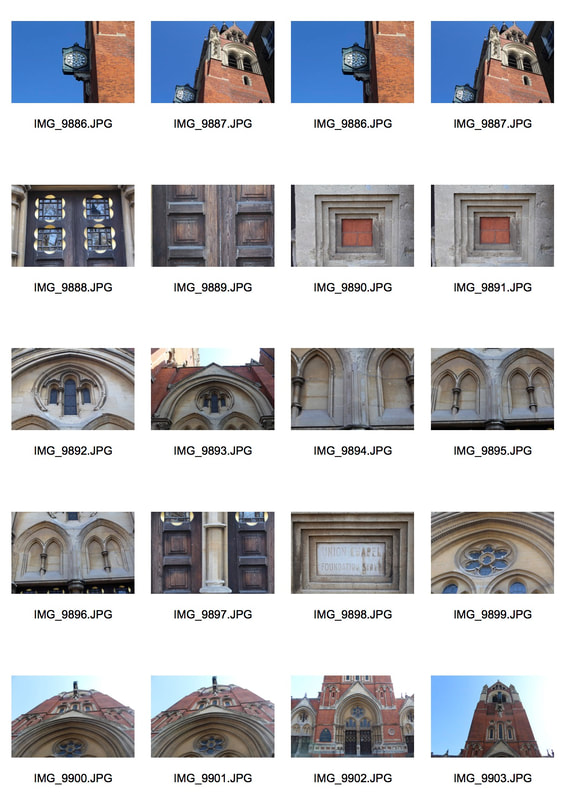
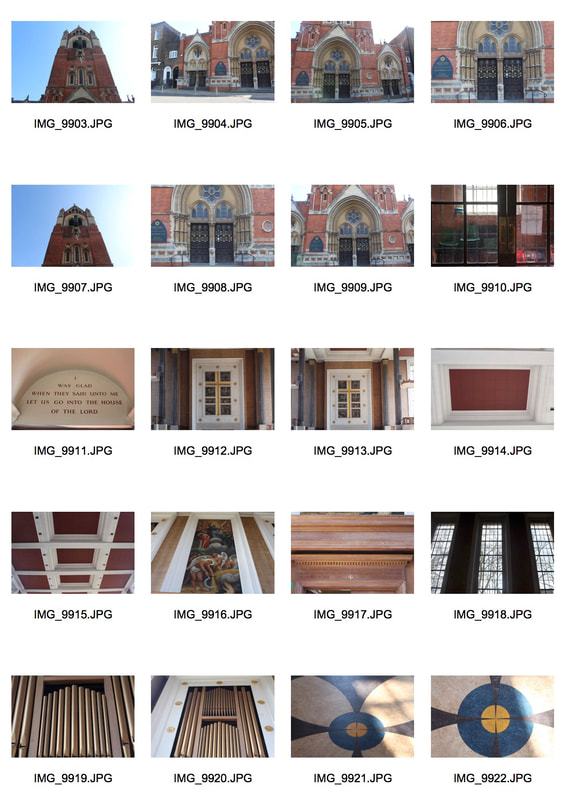
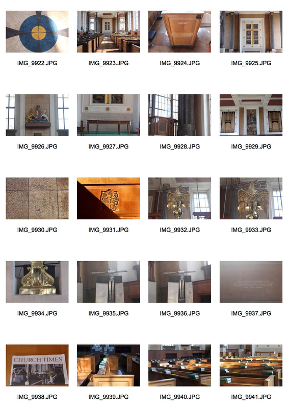
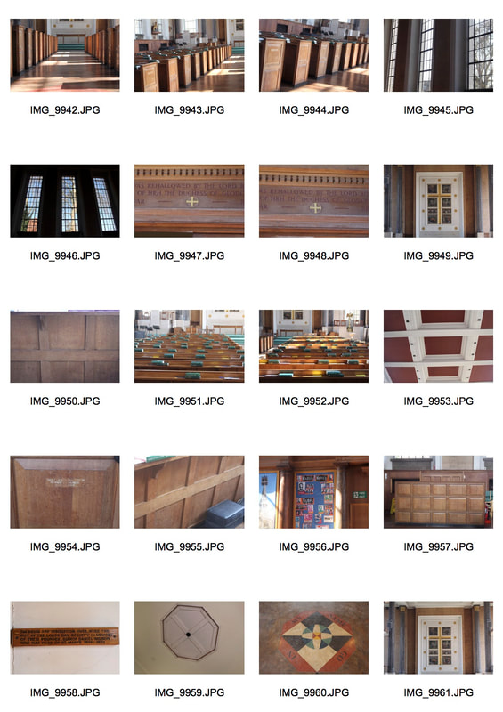
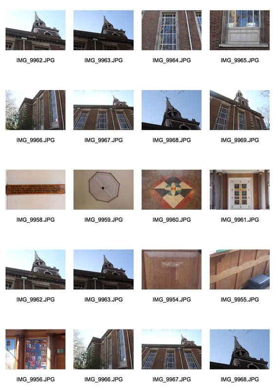
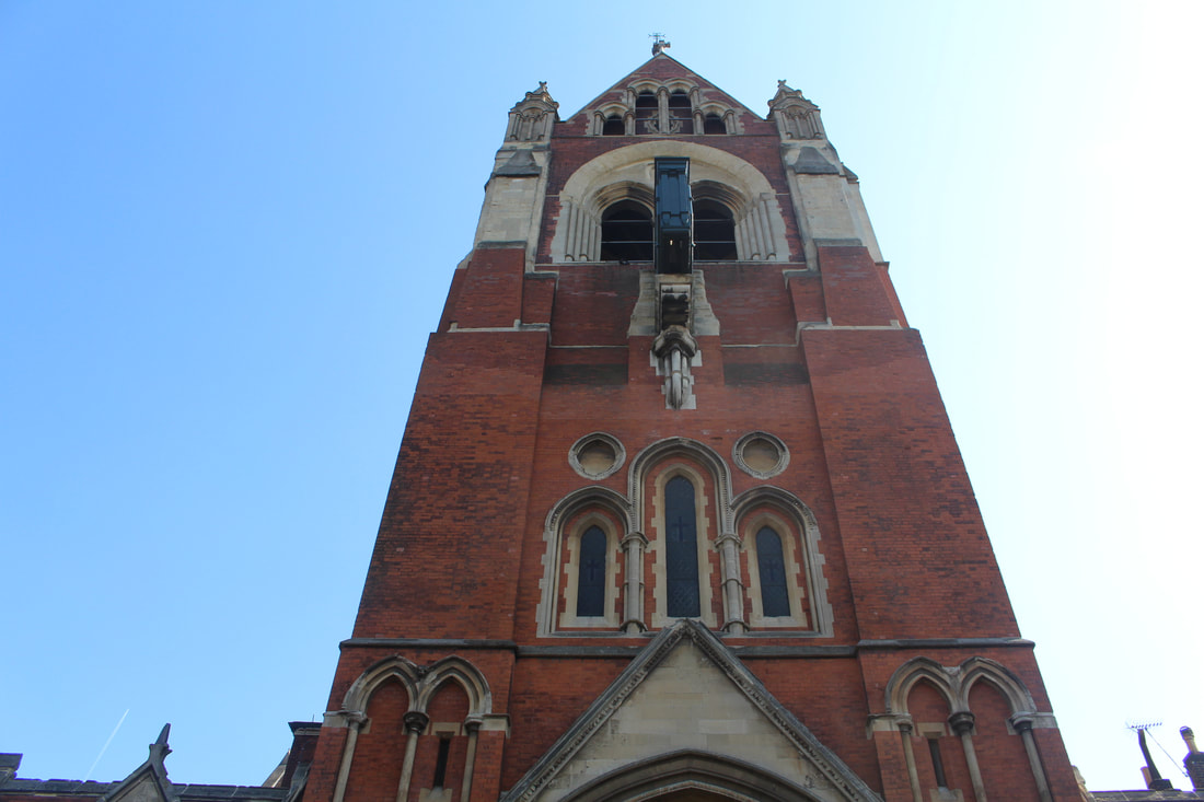
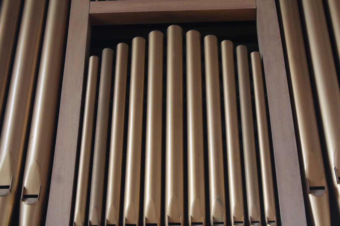
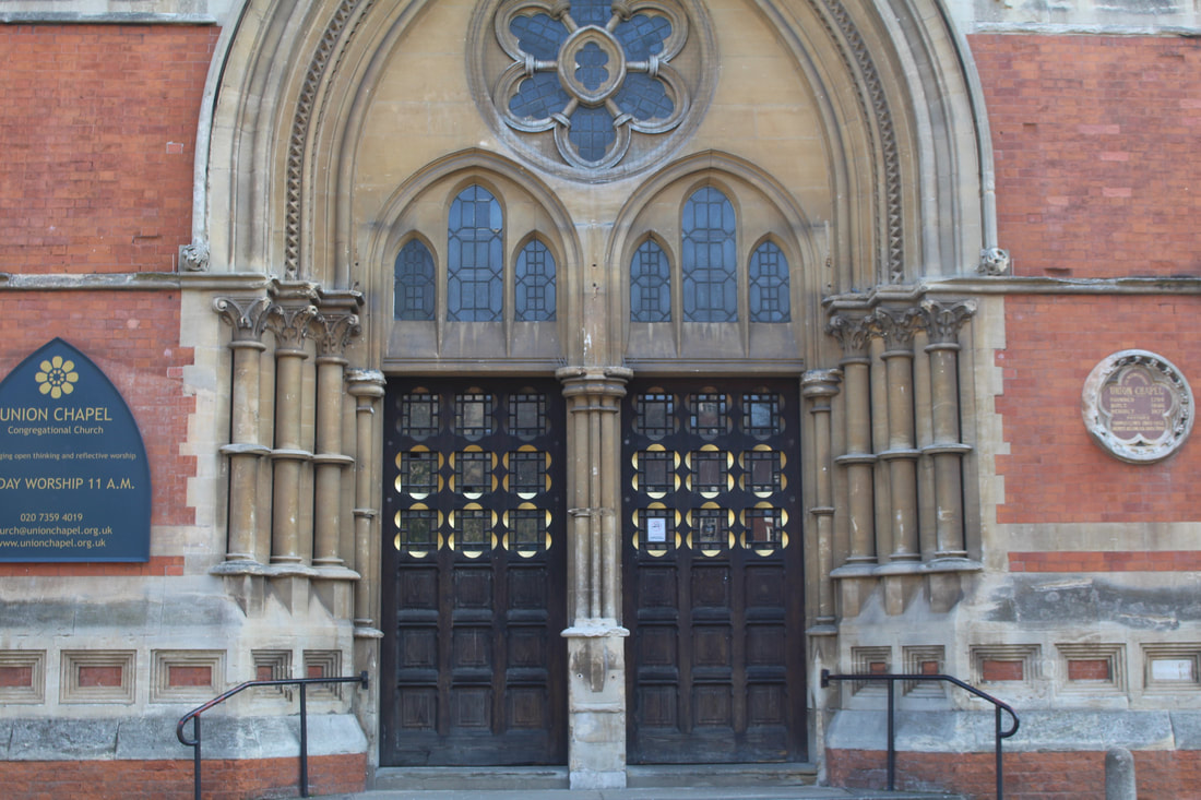
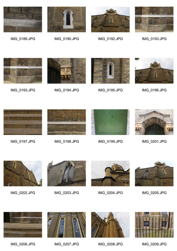
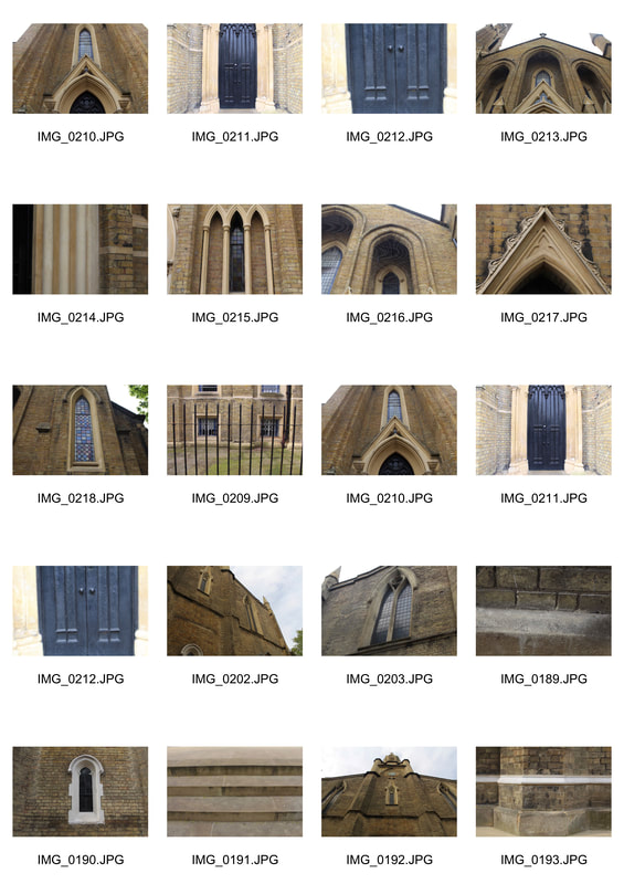
For my second strand I will look at the variation and similarity between religious places. To do this I will photograph a series of different religious buildings such as churches to see the similarities and differences between them. I will also focus my camera on the details of the buildings in order to capture some close ups. The artist I have chosen to help me with the developments and response to this task is Jacob James who documents different cultures and captures different religious buildings.
artist analysis - Jacob James
Jacob James is a UK based internationally published travel and cultural documentary photographer. Jacob’s work has been published in well known photography publications both in the UK and worldwide such as Digital Camera, Amateur Photographer, Tutti Fotografi and N-Photo. His work has also appeared in numerous exhibitions and books. Jacob has worked with a number of clients across Europe and Asia including the Austrian and Hungarian tourism boards and is available for assignment globally.Jacob has worked with some of the biggest names in the photography world and is currently working as an ambassador for Panasonic UK, Manfrotto and X-Rite as a part of their Coloratti. He also has partnerships with brands such as Paramo, Eagle Creek and Phottix. Jacob is also an active photo educator and keynote speaker. He has presented talks and seminars at some of the biggest photographic exhibitions and events in the world. He also runs workshops across the world teaching other photographers. Jacob is also a writer and regularly contributes photography tutorials, tips and travel writing to websites such as DigitalRev Learn, Manfrotto Image More Blog and many others.
|
|
My response
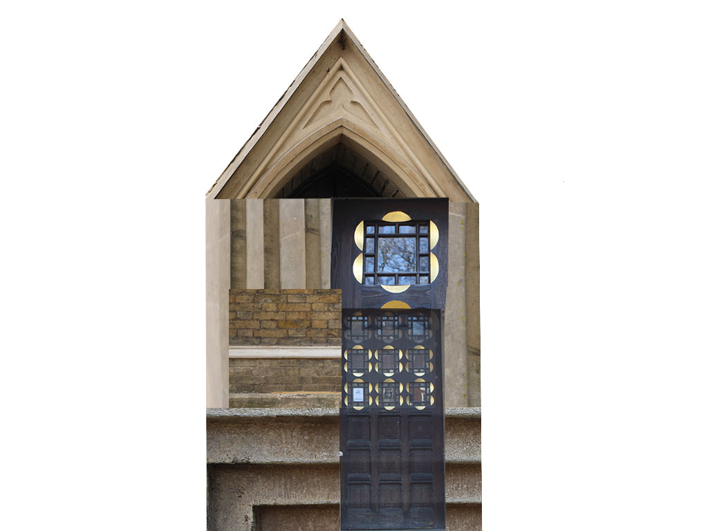
For my response I went to photograph various different churches and used the focus on my camera to enable me to capture details of the churches. Originally I was going to take pictures of various different places of worship, however I was unable to go inside some of the religious buildings of other religions such as synagogues and mosques. overall I am happy with the outcome of my images however I should have stood further away from the outside of some of the churches in order to capture the whole building better. To develop my images I decided to use photoshop to recreate a new building and church which was not as effective as I hoped for as my final building looks a little flat.
|
|
|
|
|
chosen edits
|
|
Further development
|
|
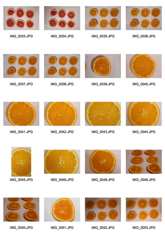
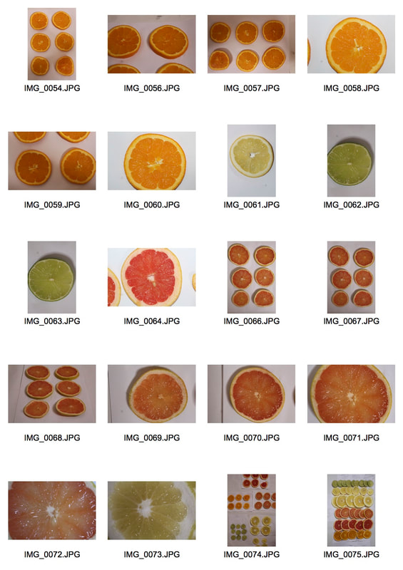
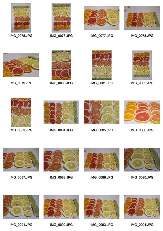
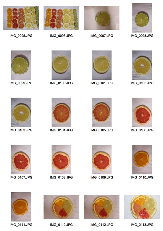
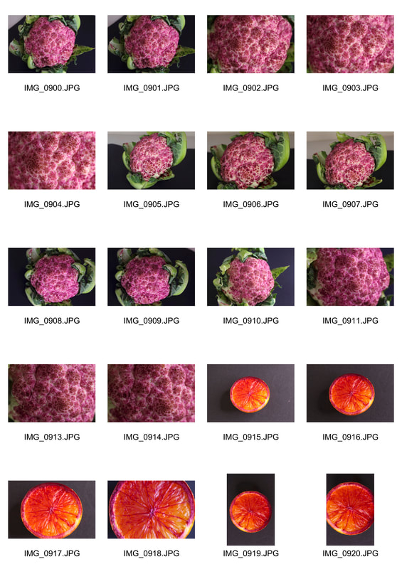
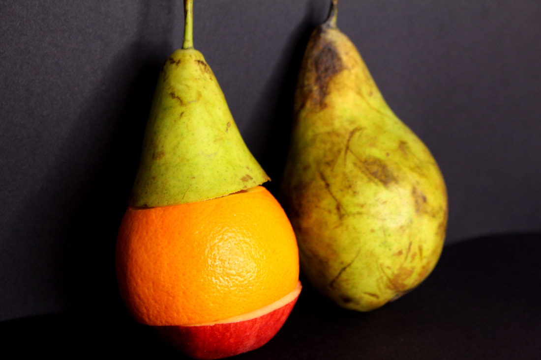
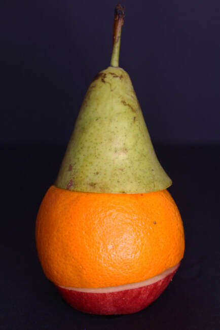
Strand three - VARIATION AND SIMILARITY IN FOOD
Şakir Gökçebağ was born in Denizli in 1965. He graduated from the Faculty of Fine Art at Marmara University in 1987. He completed his master's degree (1990) and doctoral degree (1994) at his alma mater. He won the second prize in the State Painting and Sculpture Competition in Ankara in 1991. In the same year, he got a scholarship from the Austrian government for Summer Academy in Salzburg in 1991. Gökçebağ then received a scholarship from DAAD and went to Düsseldorf Academy between 1995 and 1996. He was awarded Markus Lüpertz Prize by Düsseldorf Academy in 1996. Gökçebağ has had many solo exhibitions and participated in numerous group exhibitions in Turkey and abroad. Currently he lives and works in Hamburg.
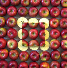
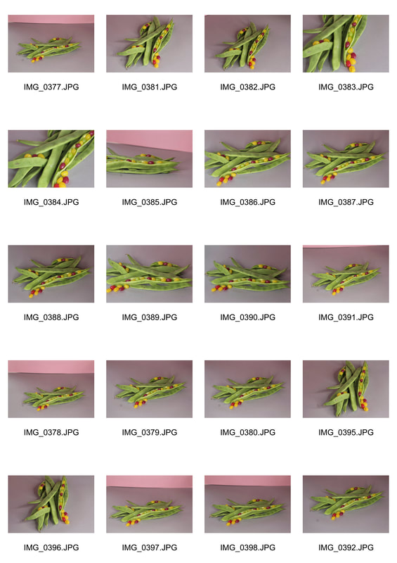
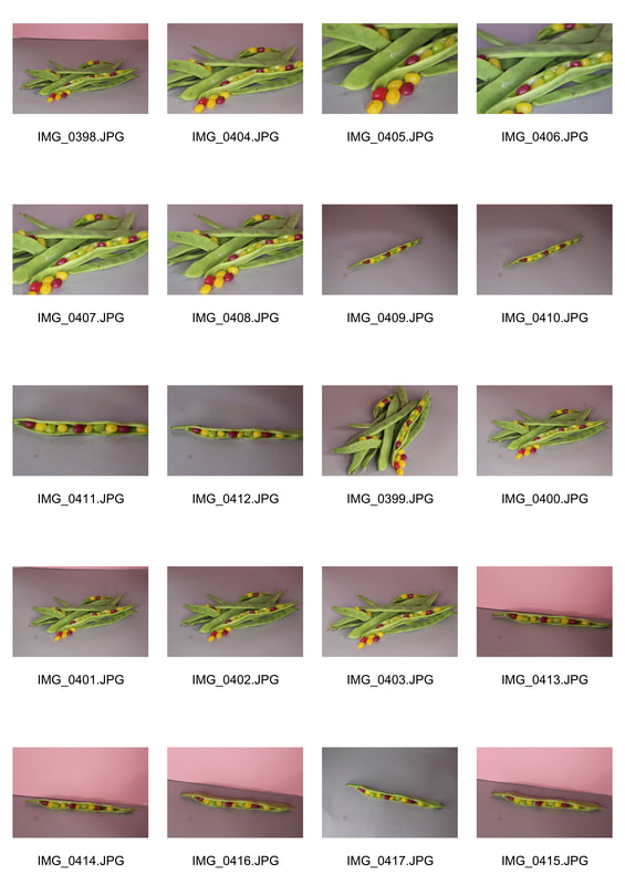
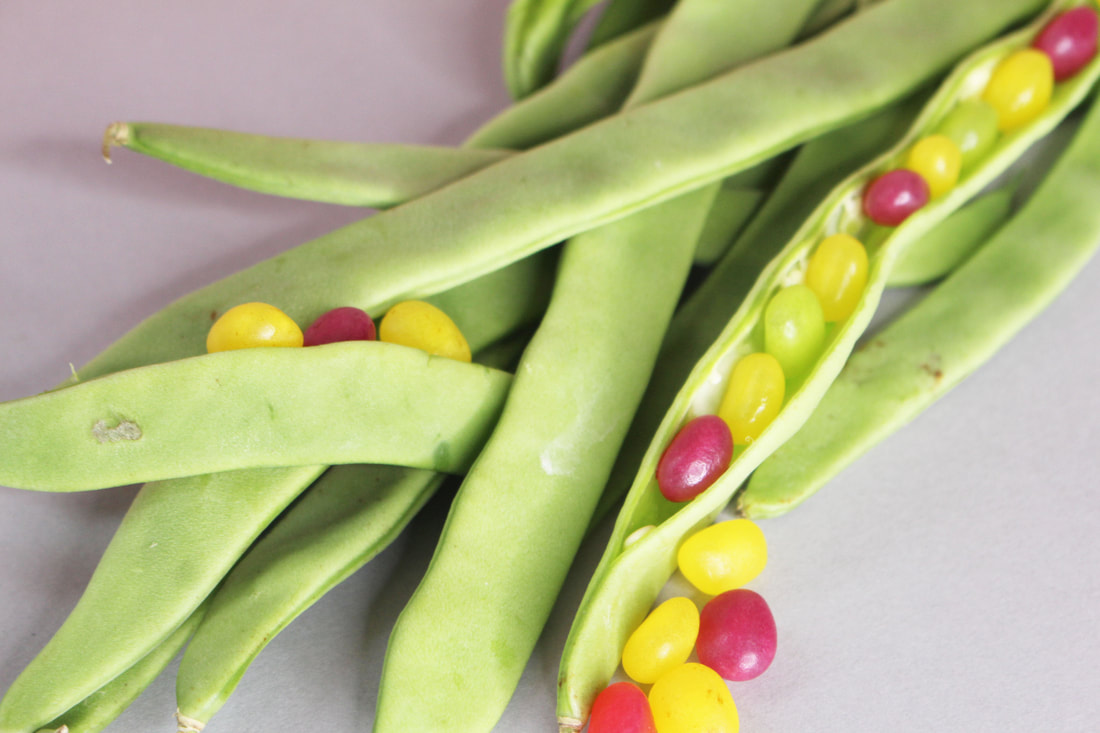
Turkish artist sakir gökçebag has skillfully re-imagined the idea of food through his series of artworks, where he arranges and organizes various fruits and vegetables into patterns to create striking visual displays. the pieces are not interfered with the use of digital manipulation – however combine meticulous orchestration of the organic forms with photography to create straight lines and perfect circles – geometry not found in the natural world. from watermelons to the humble green bean, gökçebag has designed structure with an unlikely medium.
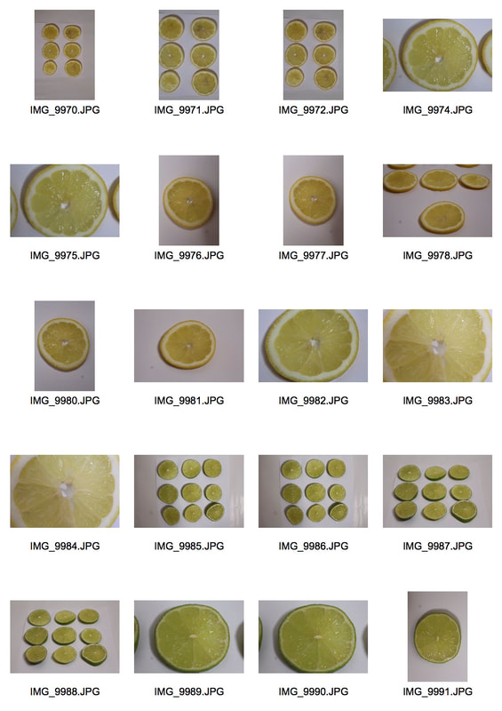
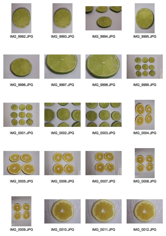
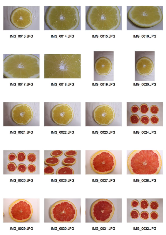
my response
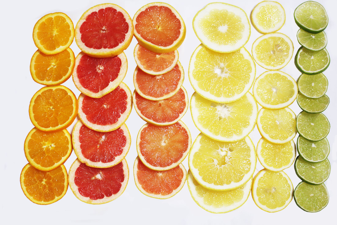
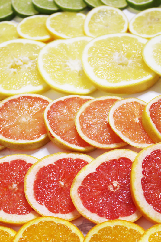
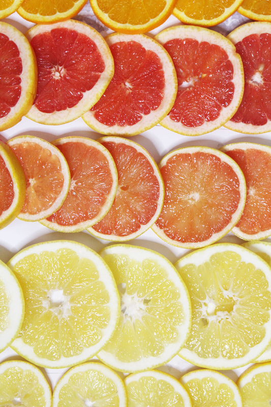
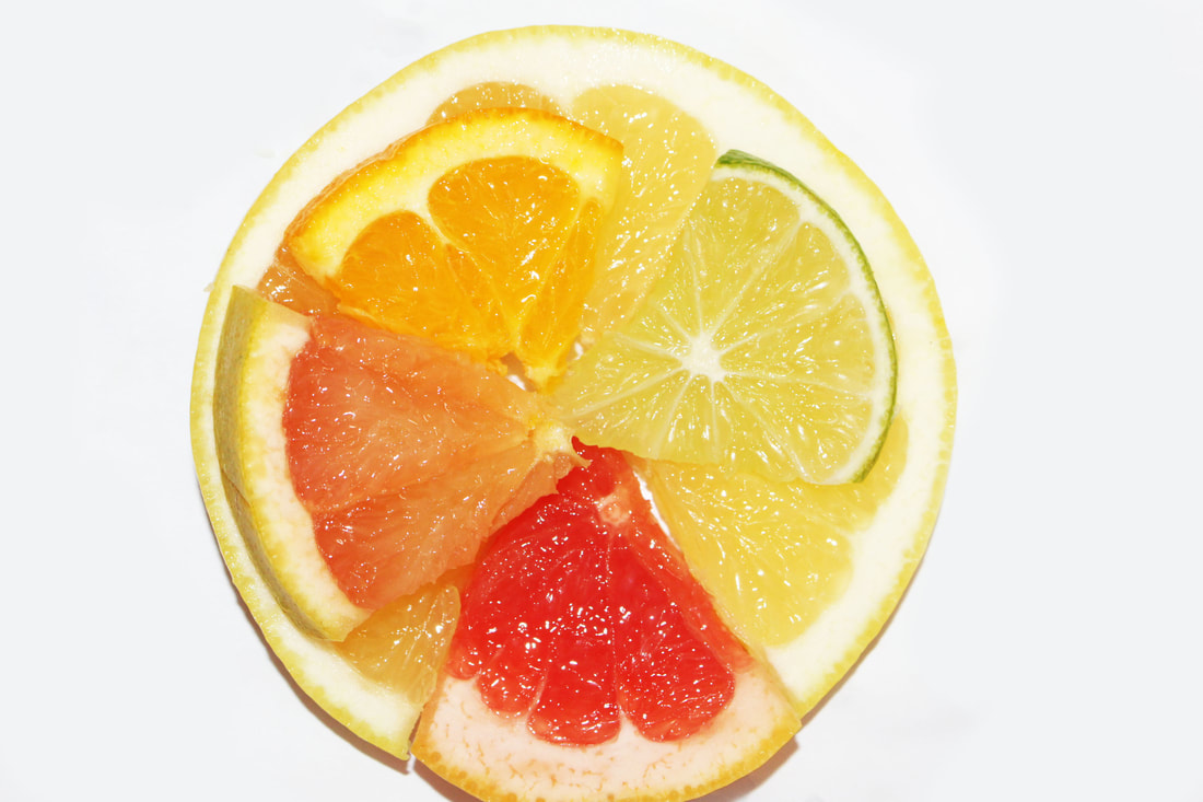
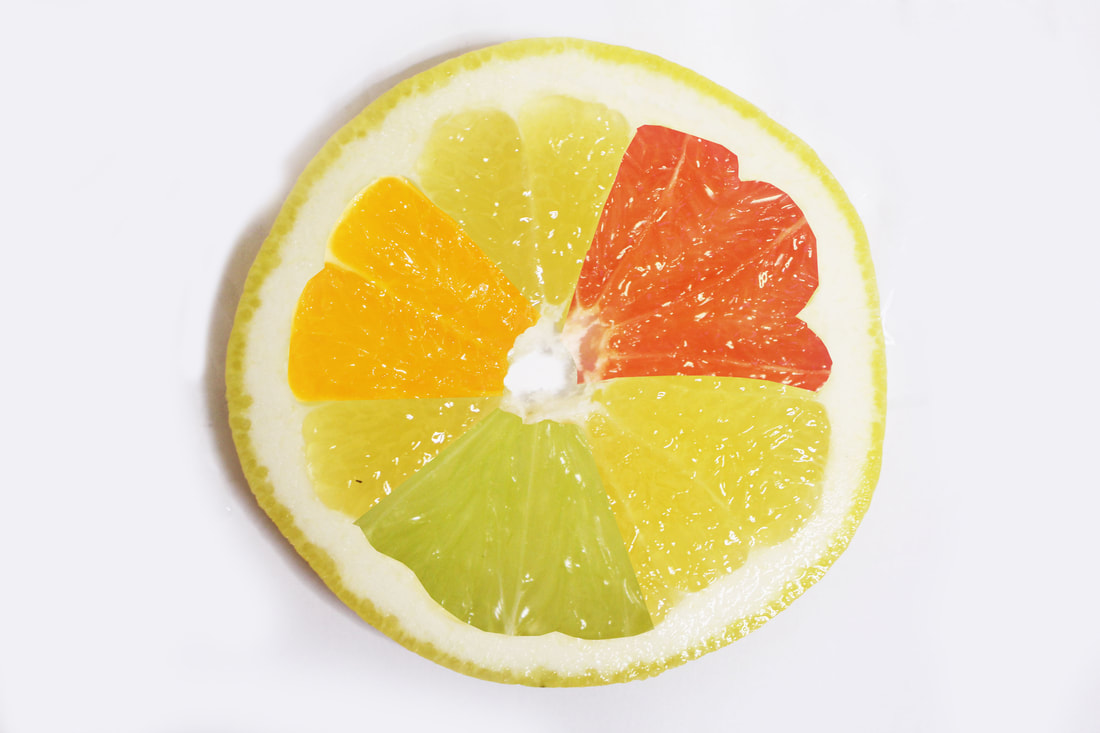
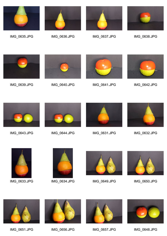
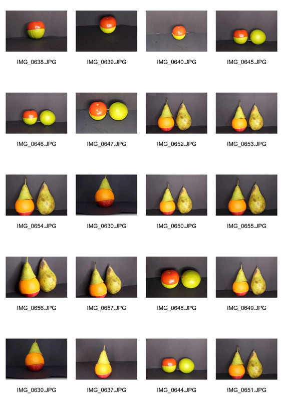
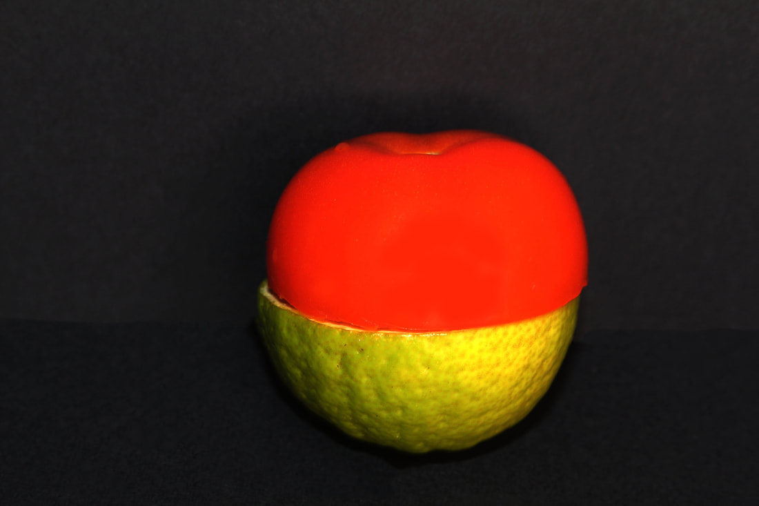
for my response to this artist I decided to photograph a series of different citrous fruits and create a collage like picture which is symmetric as possible in order to replicate the artist sakir gökçebag's work. This work relates to the exam title as I had to cut a range of citrus fruits in the same way which allowed me to see the variations and similarities between each fruit. To edit the photos I used photoshop to brighten the images that I had taken, I then photographed the final outcome from various angles to look at the image from a different prospective. To further develop this response I then decided to cut the different pieces of fruit and fit them together to create a new fruit. However this was not that effective as the pieces I had cut out manually did not fit together properly. To improve this piece of work I decided to use photoshop to do this instead as it meant I could get a cleaner cut and final image.
|
|
|
|
|
|
|
chosen edits
|
|
development
Further development
artist analysis - Dennis Wojtkiewicz
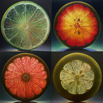
Dennis Wojtkiewicz is an American Hyperrealist painter and draughtsman. Wojtkiewicz graduated from Southern Illinois University and is artist associated with the Hyperrealist movement.He is best known for his distinctive large-scale paintings of fruit and flowers in which the subject matter is encapsulated and transfixed by a heightened approach to realism. His work has been shown in international art fairs in Bridgehampton, Chicago, Los Angeles, Miami, Palm Beach, Santa Fe, Taipei and Toronto as well as in numerous galleries and exhibitions throughout the U.S. He is a past recipient of two Ohio Arts Council Individual Fellowships with paintings and drawings represented in major public, private and corporate collections.
My response
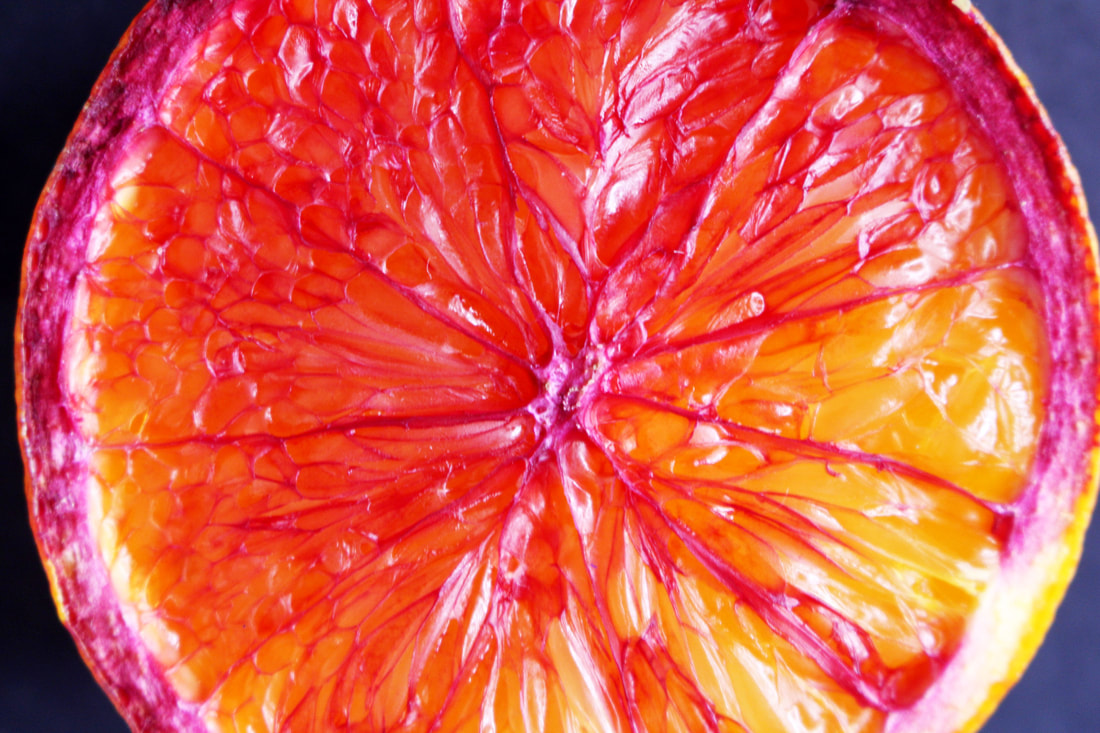
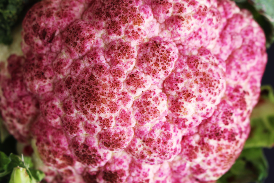
For my response to Dennis Wojtkiewicz' work I decided to photograph citrus fruits and vegetables and in order to change the appearance of them I experimnented with different food colouring to create an effective outcome of Dennis wojtkiewicz' work. Overall the outcome of the cauliflower was the least effective as the food colouring did not spread evenly as the cauliflower was left with small white gaps where the food colouring did not dye the vegetable.This meant that the final outcome was not as effective as it could of been.
|
|
chosen edits
|
|
|
|
further development
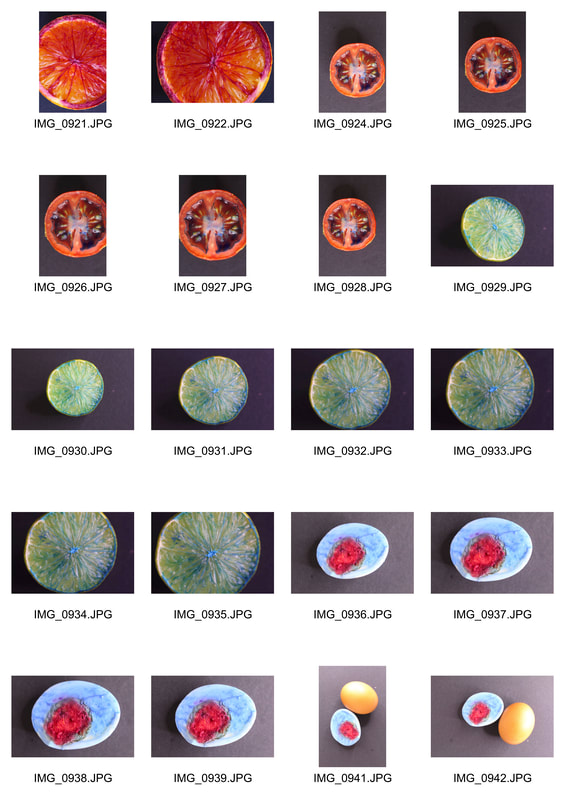
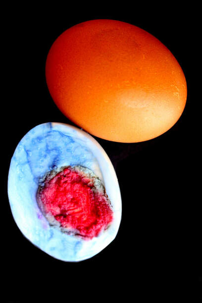
For my further development I decided to photograph a different piece of food that wasn't a fruit and using the food colouring I had used in the previous images I put it on the inside of the egg in order to change the perception of it. This was much more effective than the previous images and experiments with the food colouring as the food colouring spread much more evenly and covered he whole surface area of the egg not leaving any patches.
second development
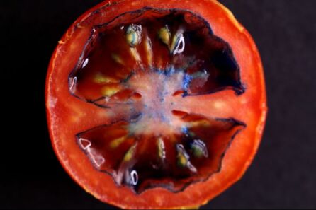
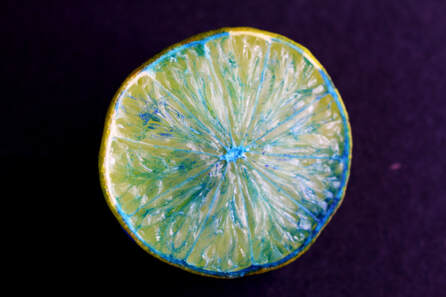
For my second development I decided to further explore recreating new fruits with a range of different fruits. To do this I focused on the appearance of one fruit and cut different different parts of other fruits in order to create my final outcome. Using photoshop I then increased the contrast and brightness in order to create the image more vibrant and effective.This development links to the exam theme as the final outcome shows that there is similarity between the shapes of different fruits as you are still able to recognise what the original fruit is before it was changed and recreated.
|
|
cHOSEN EDITS
|
|
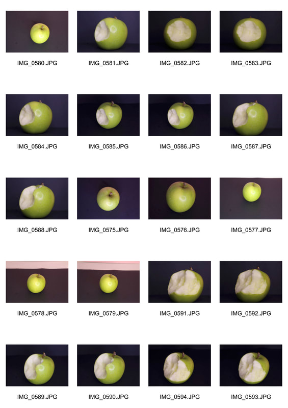
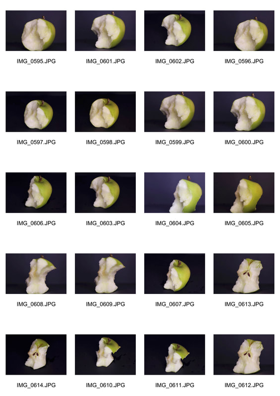
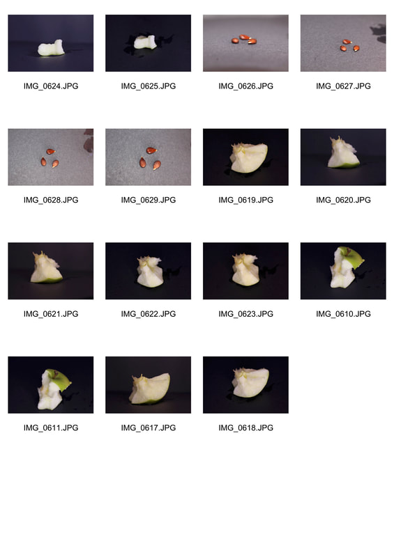
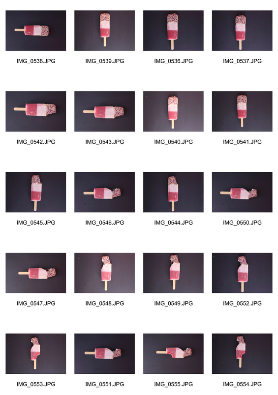
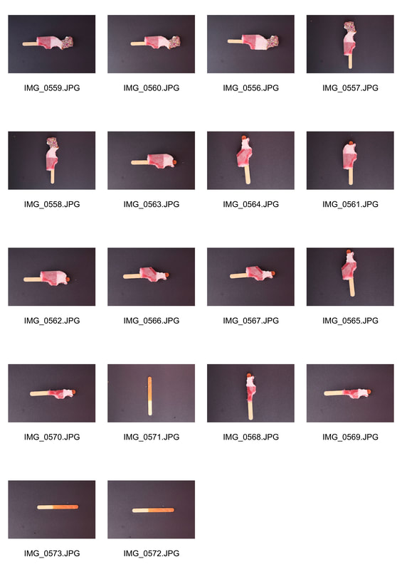
Third Development - diminishing food
For my third development I decided to focus on how the appearance food changes once it is being consumed. To do this I decided to photograph an apple and ice lolly that was being eaten to see how the appearance of the apple and the ice lolly changes and diminishes. For the final outcome I decided to create a gif using Imovie to present the pictures had taken. Overall the gif was effective as the images taken show the food being consumed and eaten however when talking the pictures I should have used a tripod so that my images were more in sync with each other in the gif.
|
|
|
|
|
further development
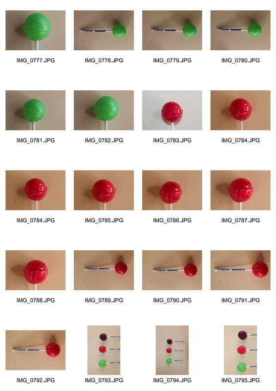
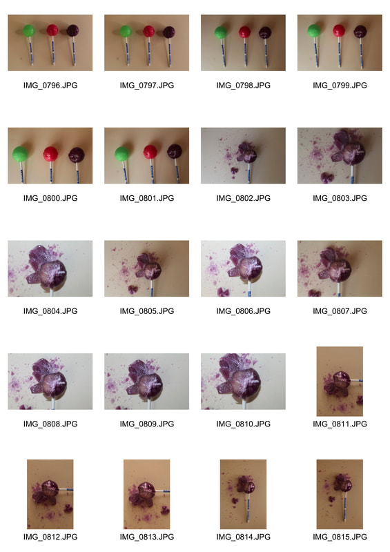
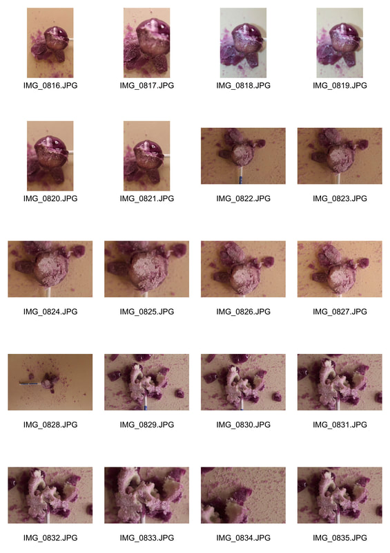
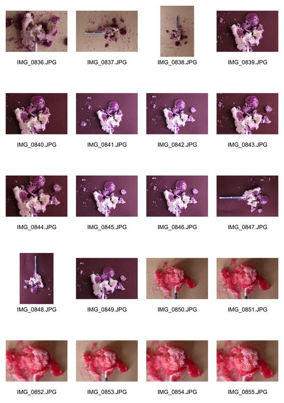
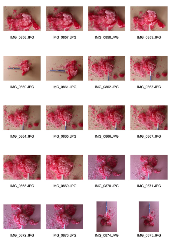
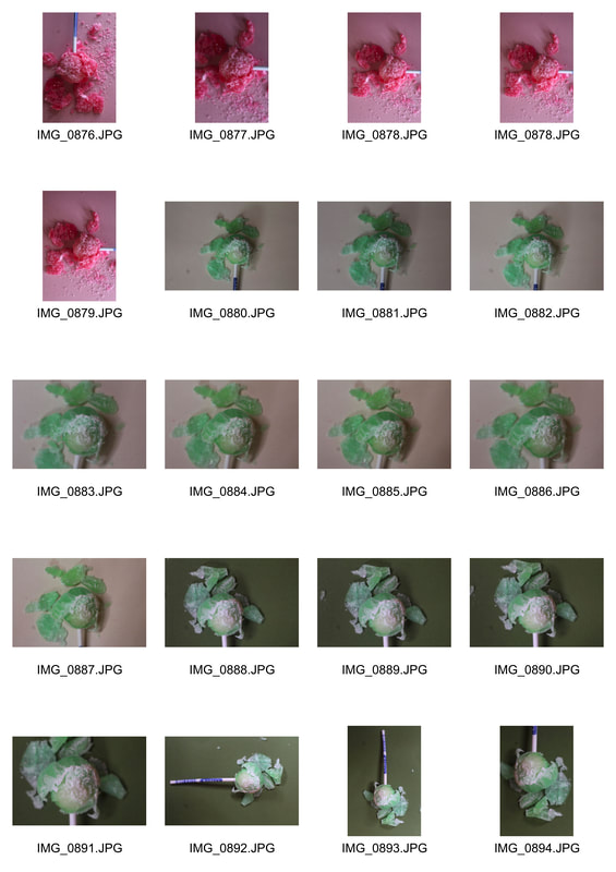
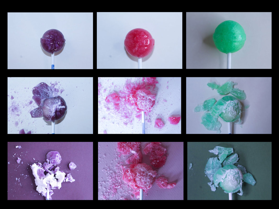
To further develop this development I wanted to further explore how appearances different foods can change. To do this I used a range of lollies and photographed the lollies their normal form and then a crushed form. I then further edited these images in photoshop using the levels tool and the the brightness and contrast tool. After I had completed editing the different images i then put them in a collage which was effective however there was one image in the centre which was too bright which makes that image a little distracting as it is not the same contrast and brightness of the different images.
|
|
|
|
|
|
|
CHOSEN EDITS
Fourth Development - changing perceptions of foods
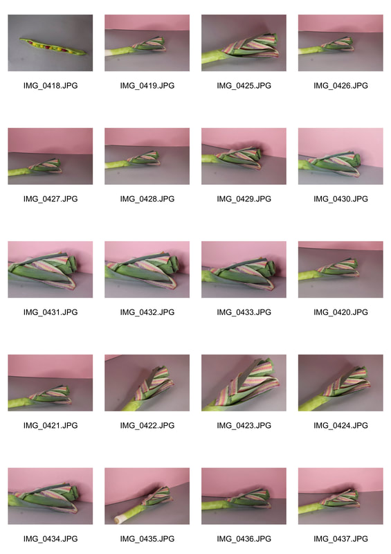
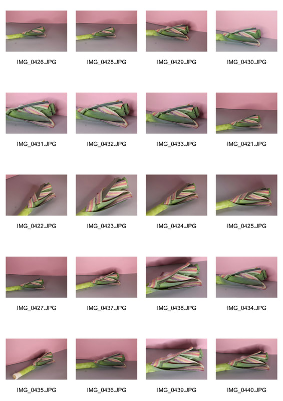
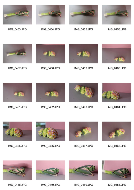
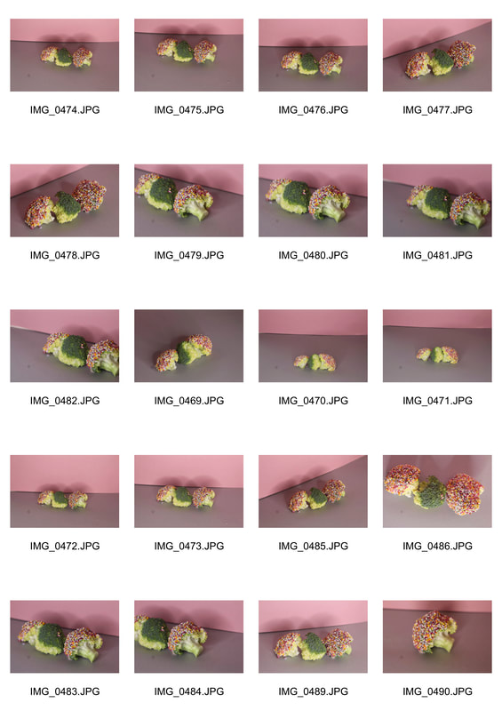
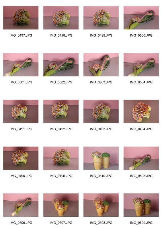
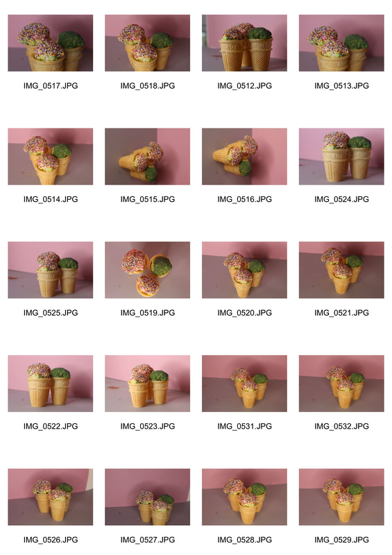
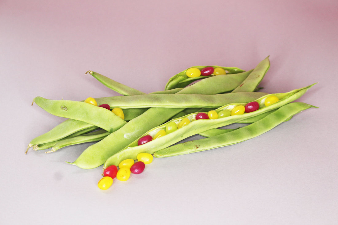
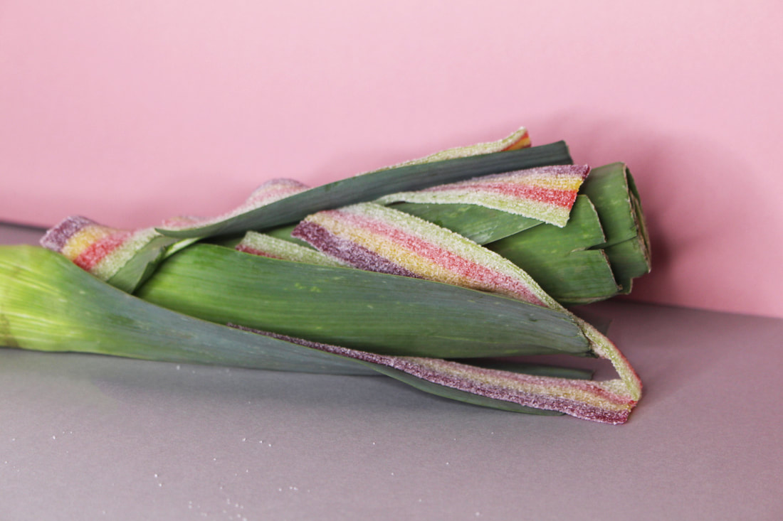
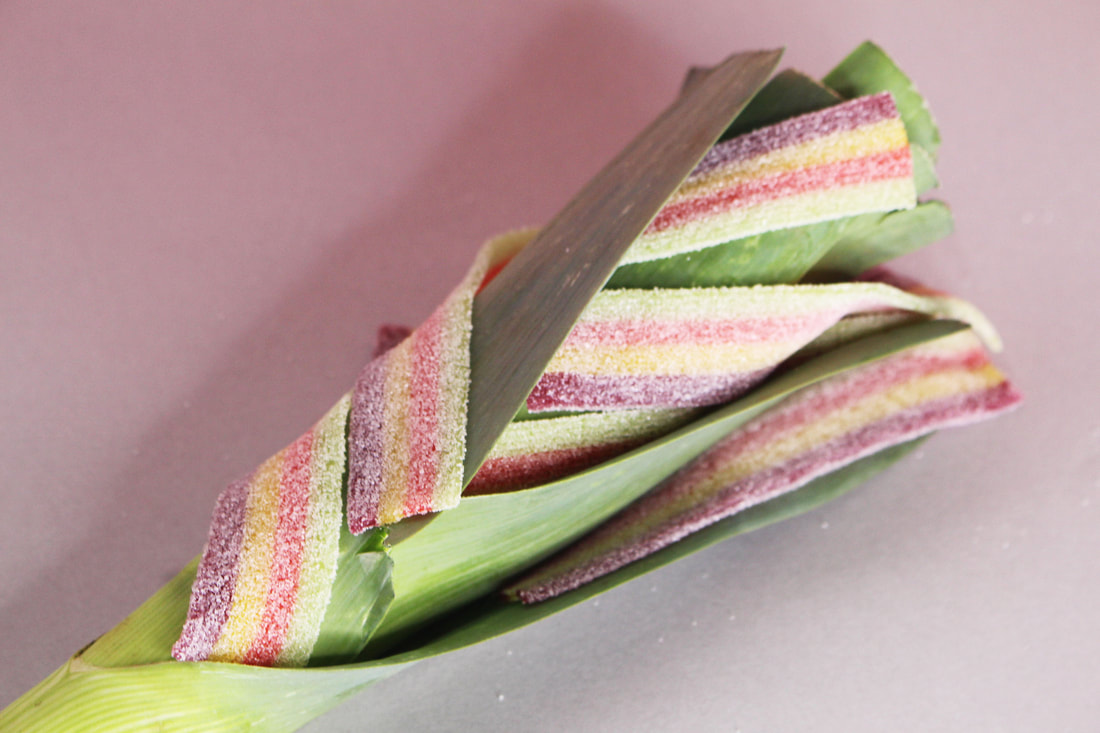
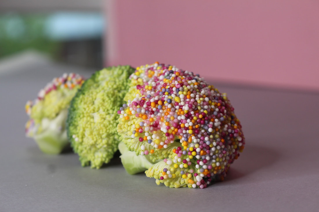
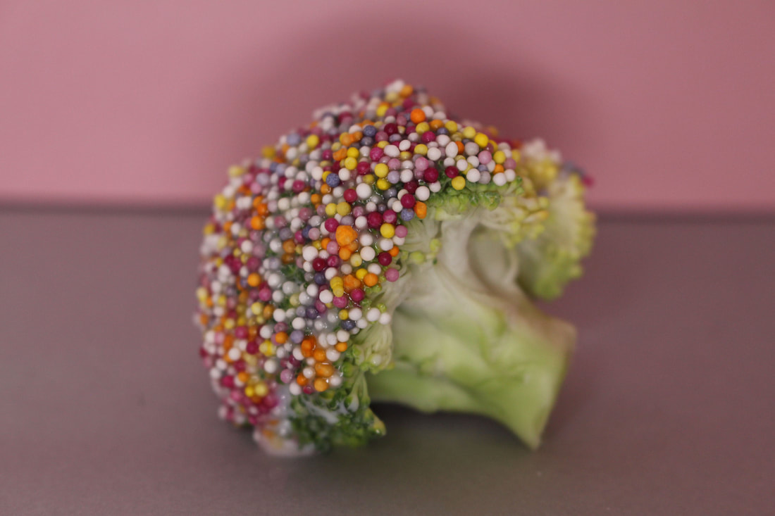
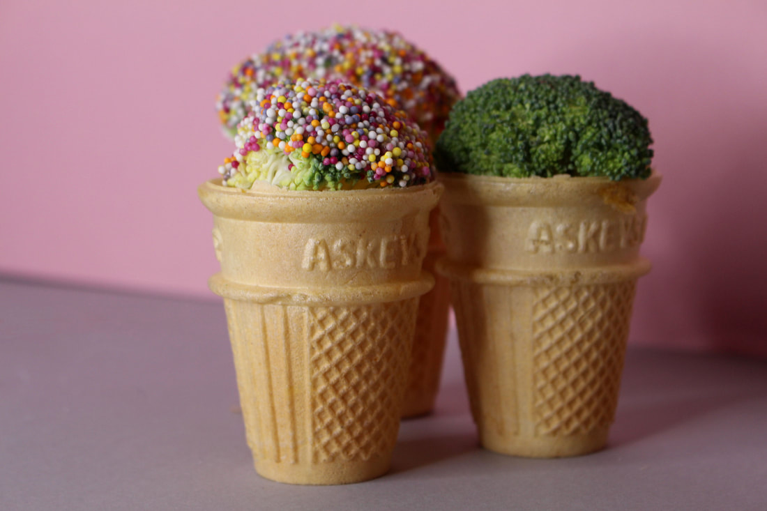
For my fourth development I decided to explore the idea of changing the perceptions of different foods. To do this I decided to get a range of different vegetables and replace elements of them with sweets in order to make them look like different dessert treats and not so much vegetables.Overall the outcome was successful as the lighting was bright enough which enabled the pictures to not turn out dark and my camera was in focus the majority of the time enabling the images to not be blurry but focused on the subject. However the lighting could have been adjusted so that there were less shadows in some of the images. I should have also uses cauliflower instead of the broccoli when replicating the ice creams as using cauliflower could have represented vanilla ice Cream rather than having a green ice cream.
|
|
|
|
|
|
|
|
CHOSEN EDITS
|
|
|
|
|
|
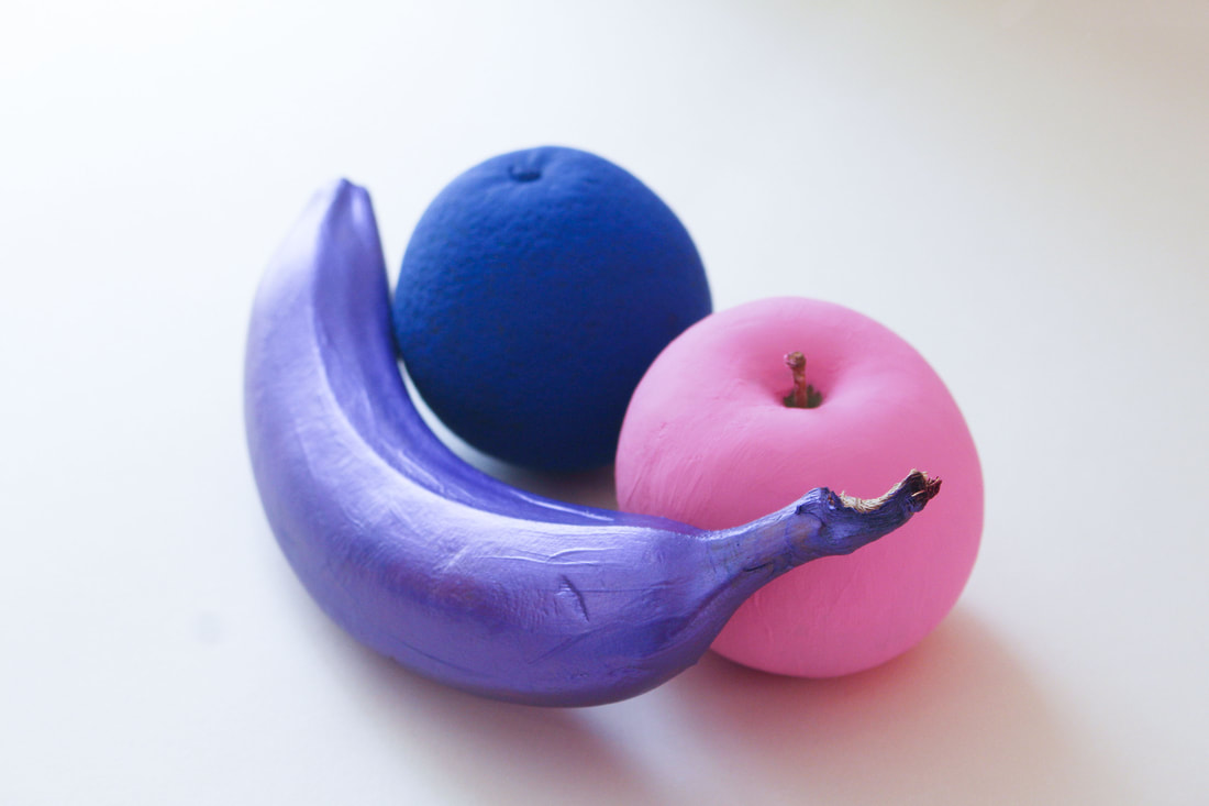
Artist analysis - Enrico backer
|
|
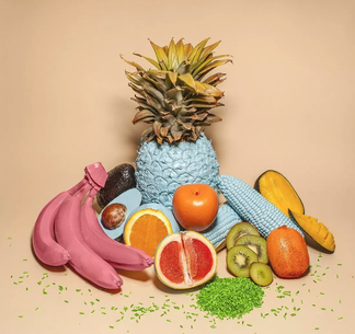
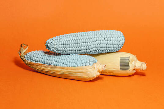
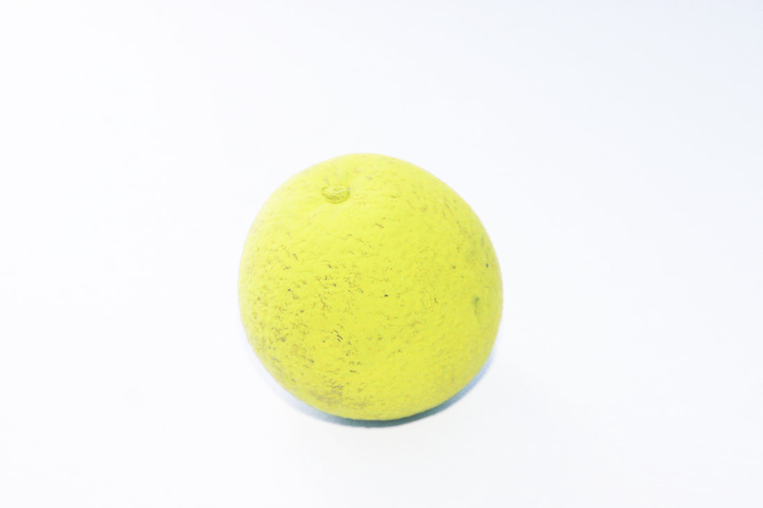
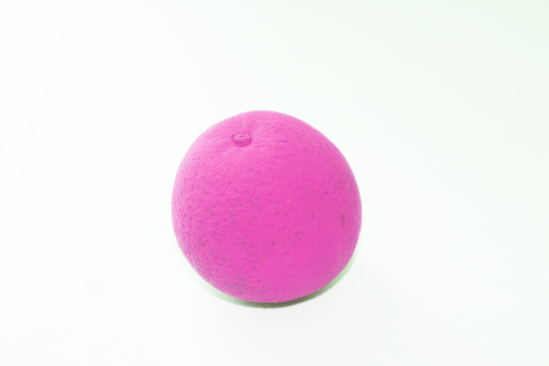
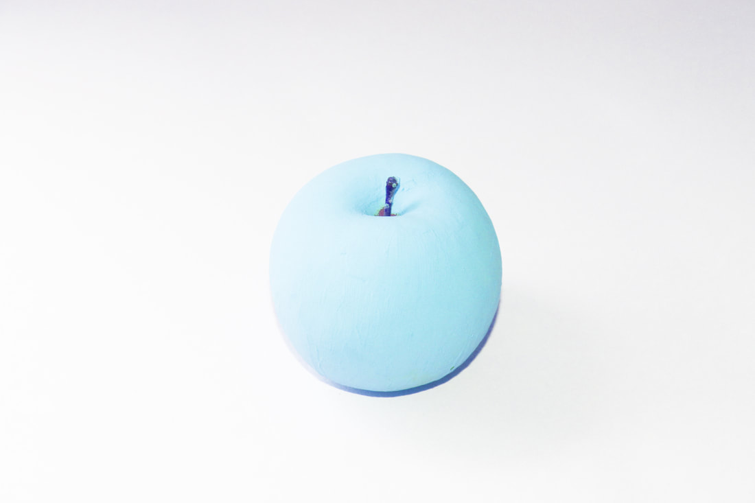
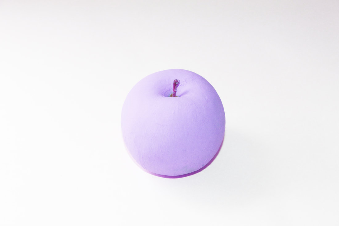
Enrico Backer is a German Multidisciplinary Design Student raised in Leipzig & currently living in Sydney. In His series GMF Fruits hi idea was to challenge preconceptions of GMO’s and have a fun look into what Genetically Modified Food could look like.The images that comprise the editorial feature puzzle the senses, showing real fruit with monochromatic, pastel tones swapped with their usual, natural ones. the style of still-life presents the edible vegetation simply and clearly, showing the pigmented parts contrasted against their normal colors. opening an avocado reveals a milky blue interior, rather than the dark green hue we’re all accustomed to; orange paint lines the exterior skin of kiwis; bananas are colorized in a hot pink tone, instead of yellow. each of the fruits are stamped directly with a barcode, furthering the impression of a potential future of genetically altered foods.
FURTHER DEVELOPMENT
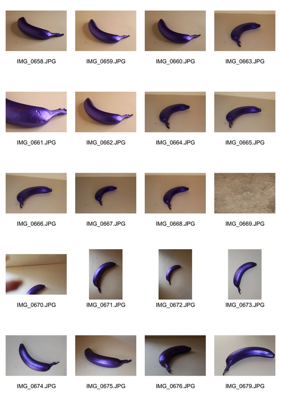
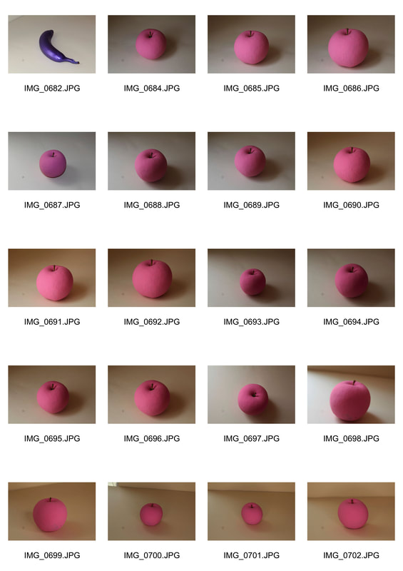
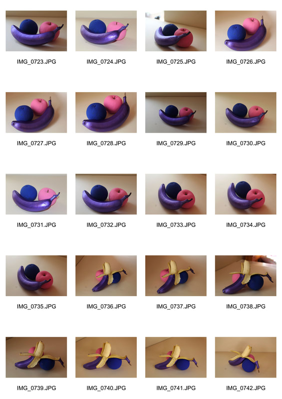
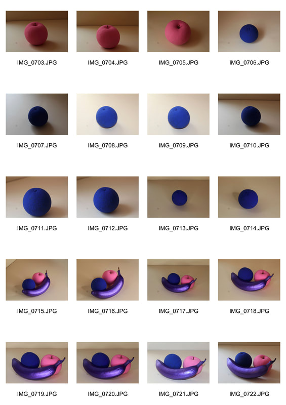
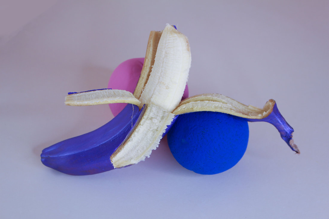
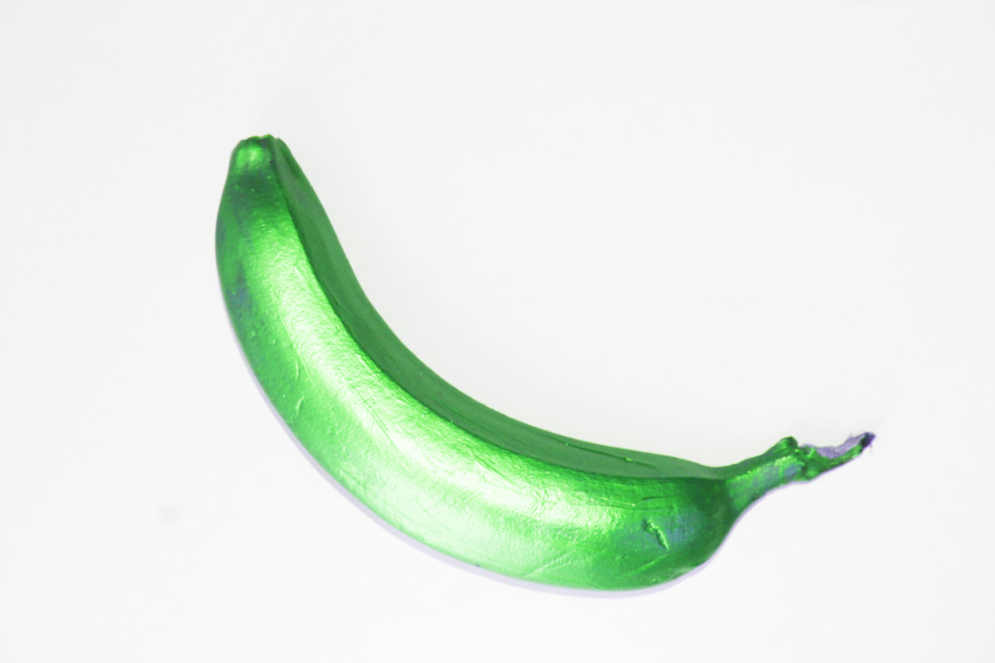
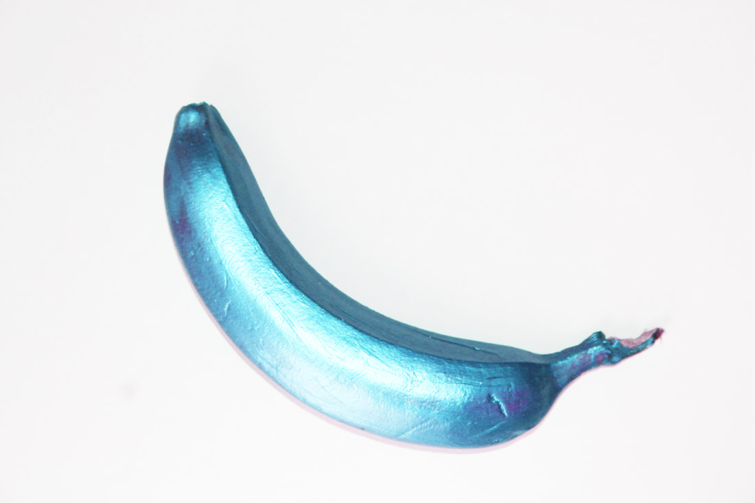
For my response to Enrico Backers work I decided to disguise and change the colour of different fruits to change the perception of different fruits. To do this I used acrylic paint and painted the skin of the fruits with a paint brush a different colour from how they are normally perceived. Overall this was effective because the final images look more realistic rather than photoshopping the fruits different colours using photoshop.
|
|
|
|
chosen edits
further development
To develop this strand further I decided to use photoshop instead of painting more fruits to change the perception of the fruits. To do this I used the hue and saturation tool on photoshop which allowed me to change the colour of the different fruits I had originally photographs. This changes the perceptions of the fruits as it forces you too see the fruit in a different way than how you would normally perceive it.
|
|
|
|
|
|
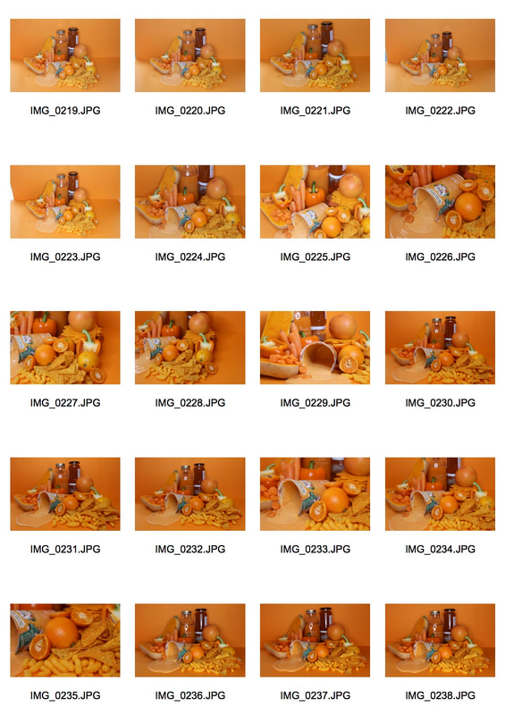
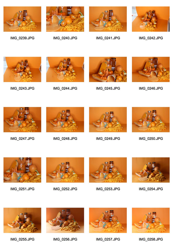
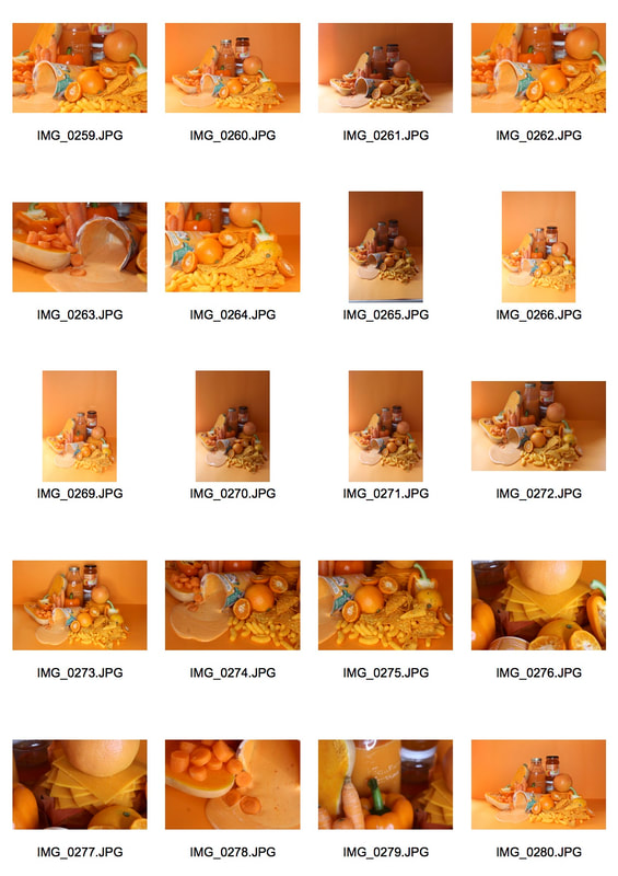
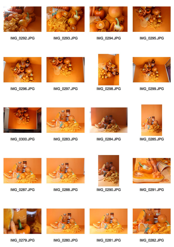
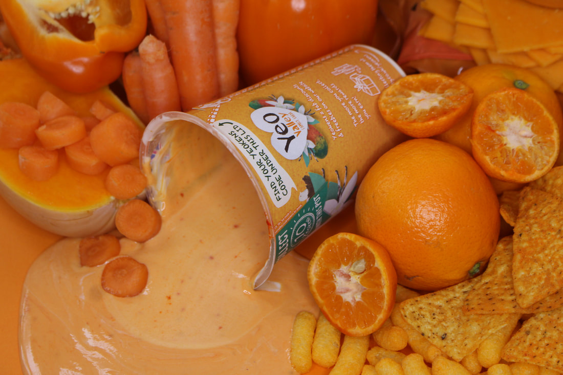
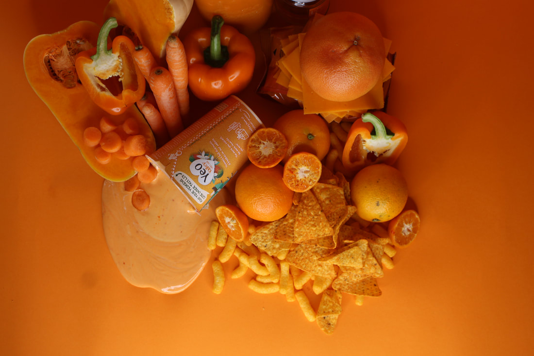
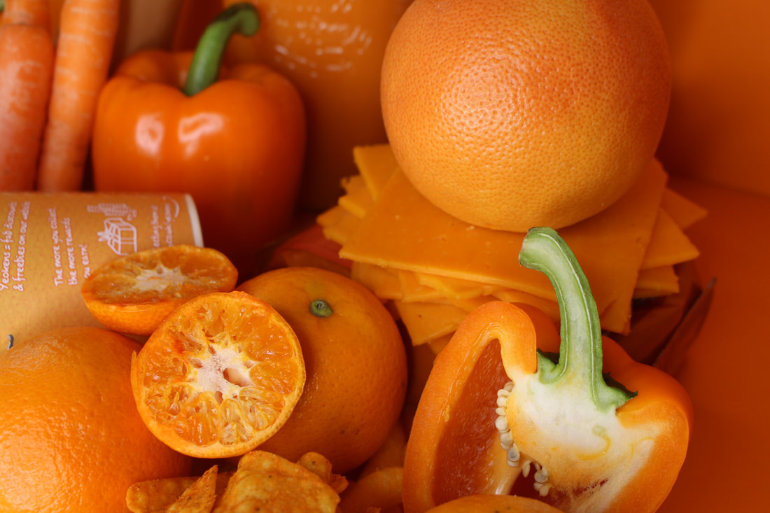
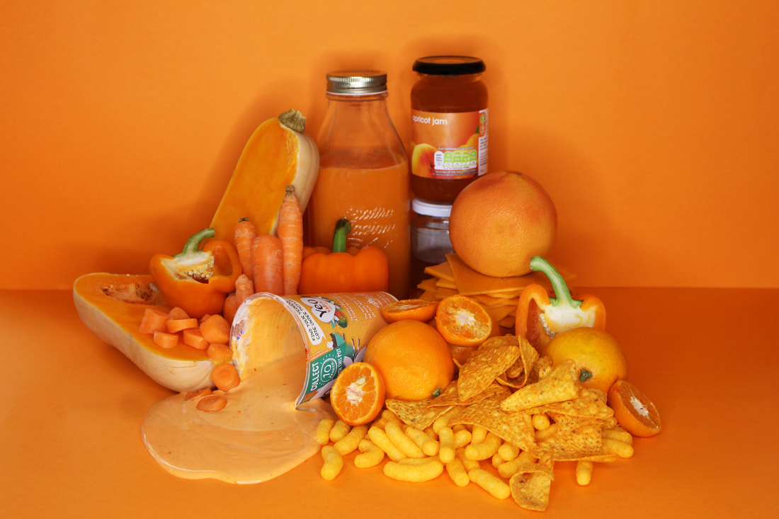
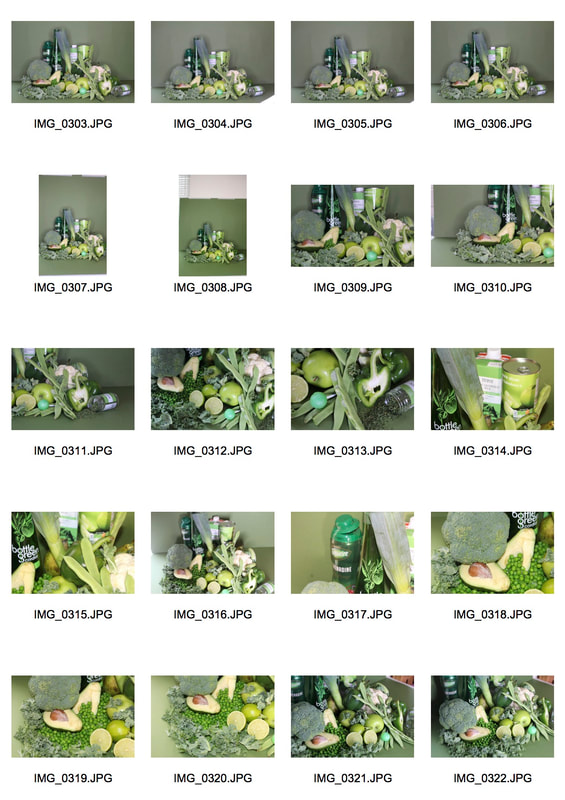
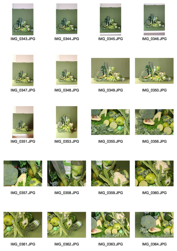
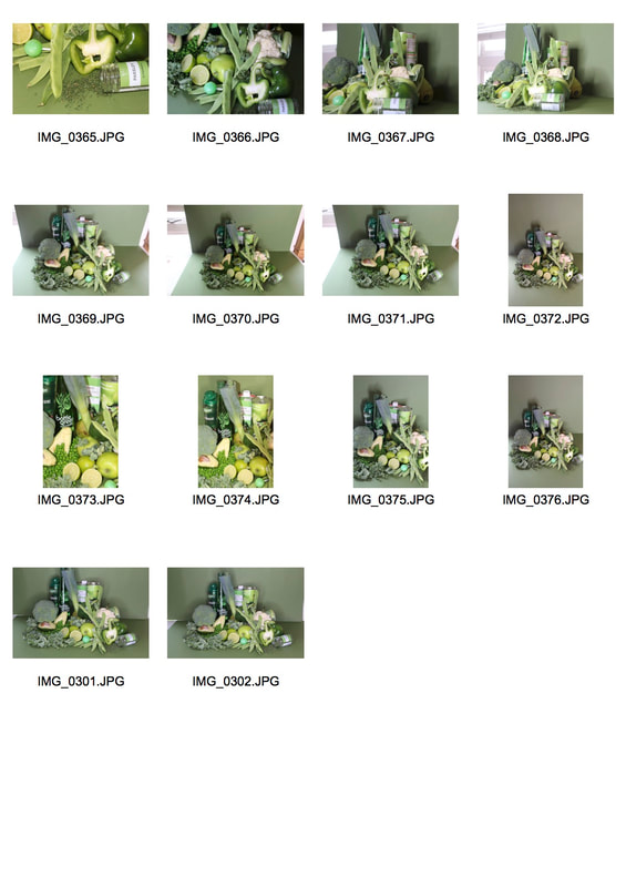
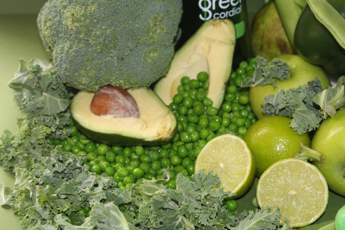
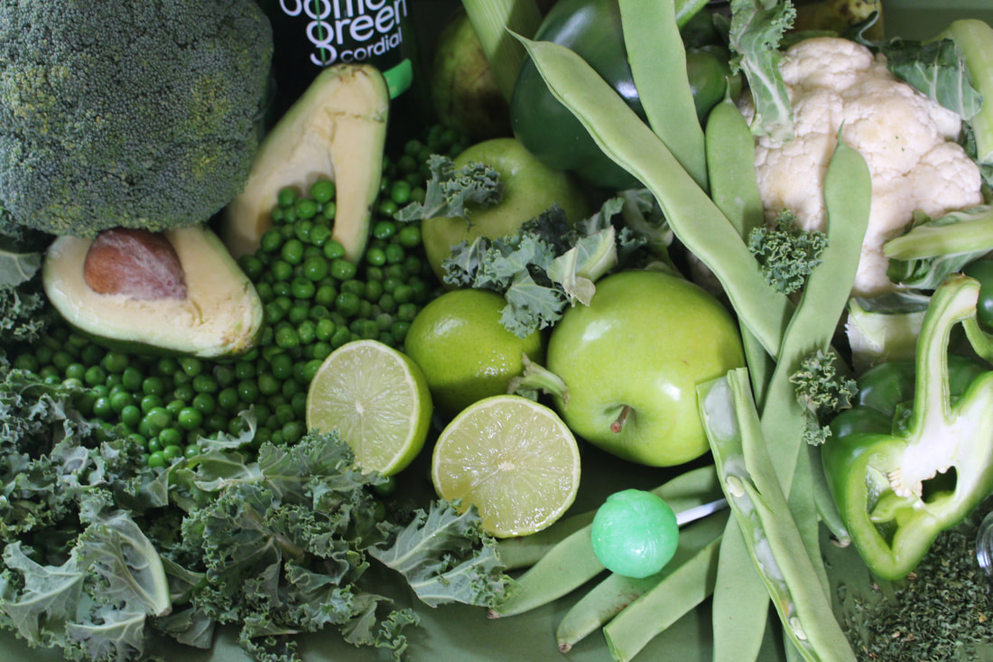
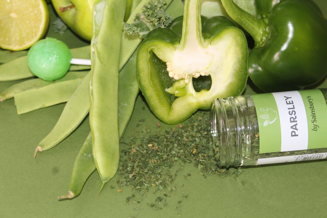
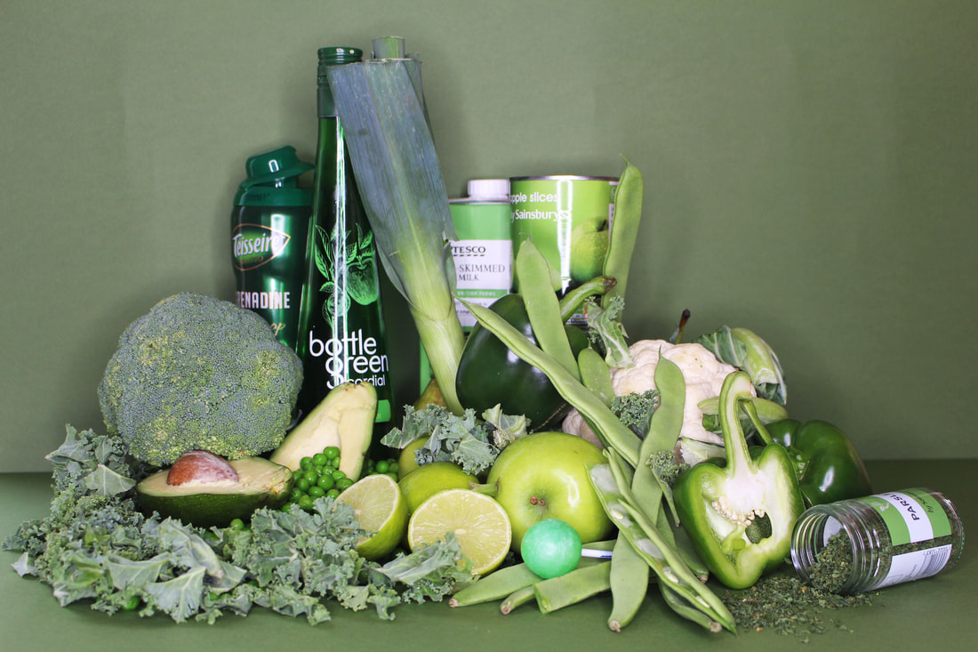
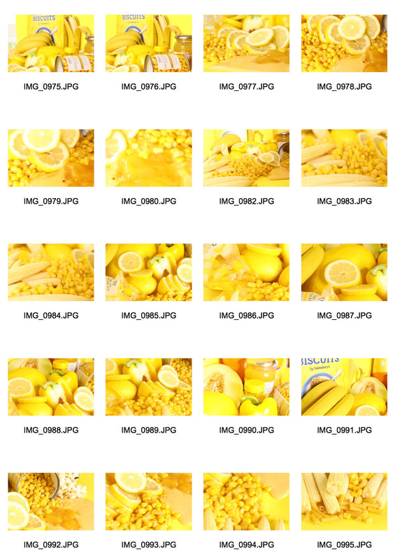
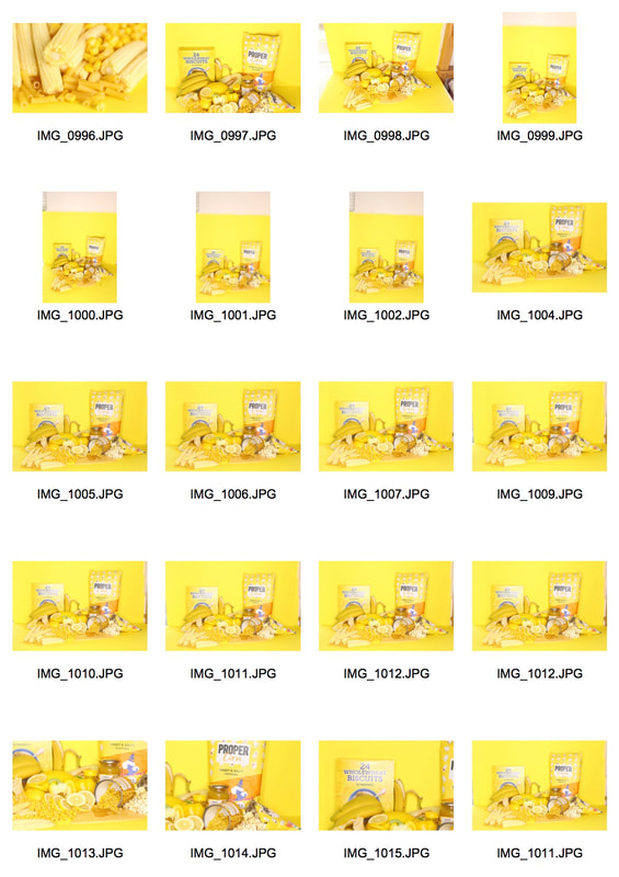
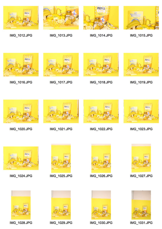
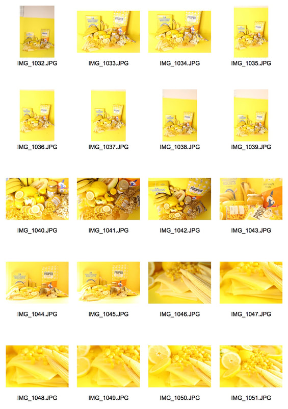
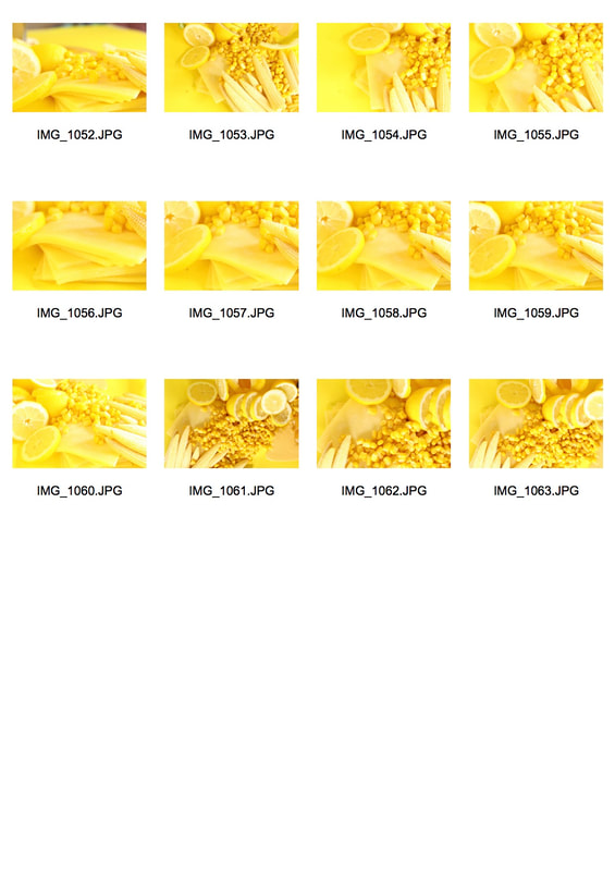
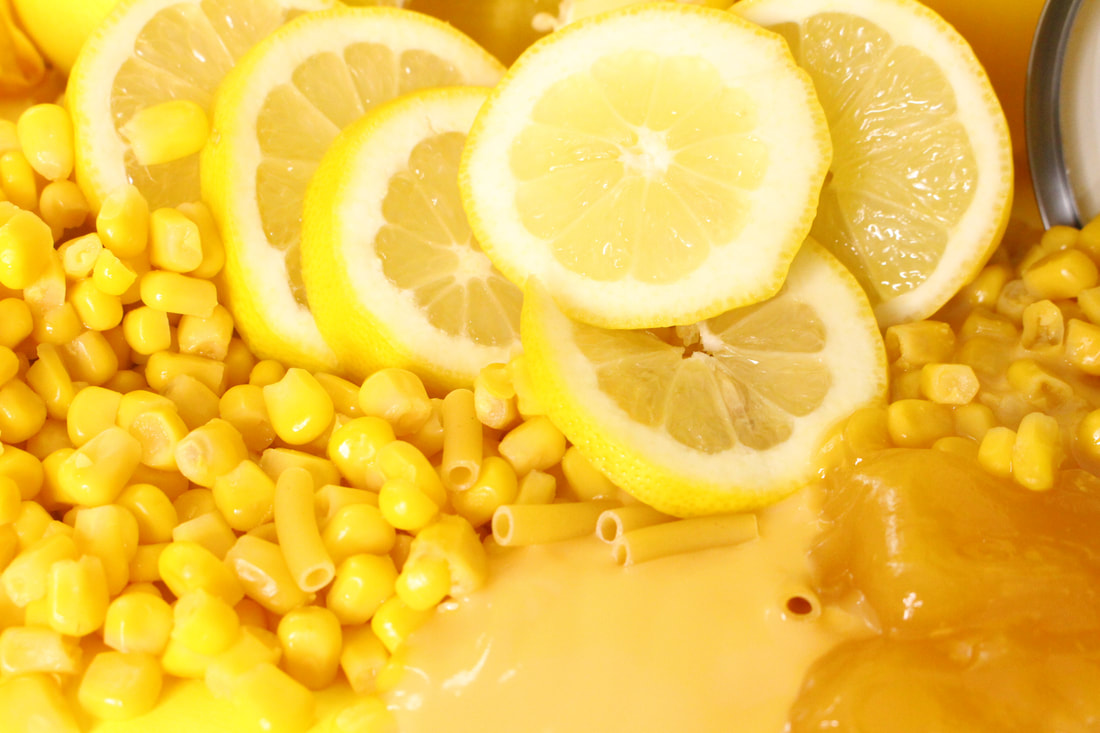
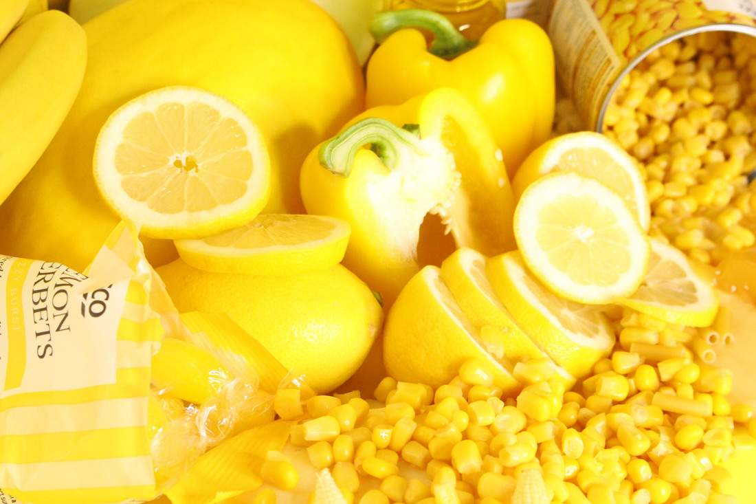
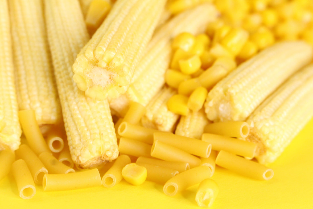
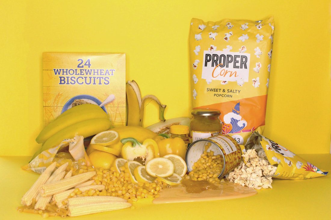
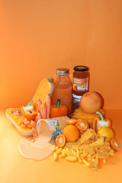
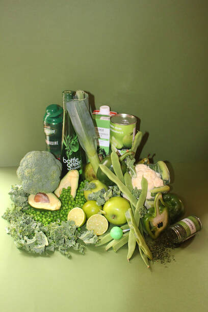
final peice
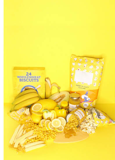
For my final peace I decided to move away from the more abstract photographs I had taken and take my final piece in a new direction. This new direction involved looking at different foods of the same colour and combining them in one image too create a final outcome. This links to the exam theme of variation and similarity as the foods I had grouped together are all similar as they all share a similarity in colour. To create my final outcome I decided to focus on 3 different colours of orange, green and yellow and focused on buying foods for each colour wth predominately those colours. Once I had collated the different colours of food I grouped them together on coloured card which was also the same colour as the foods. the photographs I had taken were extremely effective as I used a tripod to make sure I got every piece of food and part of the background in the same frame. However once I started editing the images on photoshop in noticed that the flash was in some of the reflective foods which is a little distracting to the image. To improve this in my final yellow outcomes I decided to turn flash off to avoid seeing any reflections of the flash in the images. In addition to this as yellow is already a very reflective and bright colour I had to lower the brightness and saturation using photoshop.
|
|
|
|
Close ups
final edit
|
|
|
close ups
Final edit
|
|
|
|
|
|
Close ups
final edit
Further edits
|
|